
WiseNoise 03: James Barnard on Award-Winning Logos and Why the 'Eyeball' is King
I've just wrapped up Episode 3 of WiseNoise, and honestly, this one's a cracker. James Barnard: award-winning logo designer and founder of the 'designerrrs' community: sat down with me to talk about everything from optical illusions to hiding llamas in logos.
If you're a designer, a business owner trying to understand what makes a great logo tick, or just someone who appreciates a good design story, this episode is for you.
The Eyeball vs. Grid Debate: Why Your Eyes Don't Lie
One of the most fascinating things James and I discussed was the age-old debate between trusting the grid and trusting your eyeball. For those who don't live and breathe design, here's the gist: when you're creating a logo, you can rely on mathematical precision (grids, measurements, perfect alignment) or you can use your eye to make adjustments based on how things actually look.
James is firmly in the eyeball camp, and he makes a bloody good argument for it.
He explained how optical illusions, like the Pogendorf illusion or what he calls the "bone effect",: can make mathematically perfect shapes look wonky. Your brain plays tricks on you. A circle that's perfectly centred might look off-centre. A letterform that's geometrically balanced might feel heavy on one side.
The solution? Trust your eyes. Make those tiny adjustments that break the grid but fix the visual balance. It's not about being sloppy: it's about understanding that design exists in the real world, where human perception trumps mathematical perfection every single time.
This really struck a chord with me because I've experienced it countless times in my own work. You can measure something to the pixel, but if it doesn't feel right, it isn't right.
Billy Bear's Nursery: Building Blocks & Fresh Starts
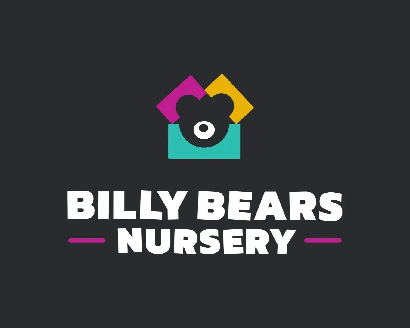
James shared one of my favourite stories from the episode: the Billy Bear's Nursery logo. This was a struggling business that needed a complete rebrand, and James delivered something genuinely clever.
Using building blocks as the visual concept, he created a logo that perfectly captured the playful, foundational nature of early childhood education. But here's the genius bit: he incorporated negative space in a way that gave the logo depth and character without cluttering it up.
The result? A fresh, memorable identity that gave the business a fighting chance to stand out in a crowded market. It's the kind of work that reminds you why good design matters: not just aesthetically, but commercially.
As someone who works with small businesses regularly, I know how much pressure there is to get the brand identity right on a tight budget. James's approach shows that smart thinking beats big budgets every time.
Metalama: Hiding a Llama in a C# Hashtag (and Winning 6 Awards)
If you thought hiding a llama in a C# programming hashtag sounds impossible, you clearly haven't met James Barnard.
The Metalama project is the stuff of design legend. James managed to create a logo that not only worked brilliantly as a brand mark but also contained a hidden llama: a visual Easter egg that added layers of meaning and memorability to the design.
The project went on to win six design awards, and honestly, when you hear James break down how he approached it, you understand why. It's not just clever for the sake of being clever: it's clever in service of the brand. The llama isn't random; it's part of the story, part of the identity.
This is what separates good logo design from great logo design. Anyone can make something that looks nice. The real skill is making something that means something, that has depth, that rewards closer inspection.
Dealing with "Ex-Boyfriend Energy": Working with In-House Teams
Here's a dynamic that doesn't get talked about enough: what happens when you're brought in as an external designer to work alongside an in-house design team?
James calls it "ex-boyfriend energy," and the term is perfect. There's often this awkward tension: the in-house team might feel like their territory is being invaded, or that their work is being judged. As the external designer, you're trying to collaborate while also proving your value.
James shared his experience working on the Archon Studio project, and how he navigated this tricky relationship. The key, he says, is respect and communication. You're not there to show anyone up. You're there to bring a fresh perspective and collaborate toward a common goal.
I've definitely felt this dynamic in my own work. It requires a particular kind of emotional intelligence: knowing when to lead, when to follow, and when to just shut up and listen.
Self-Promotion Without the 'Ick': The Power of Storytelling
Let's be real: most creative professionals hate self-promotion. It feels gross. It feels like bragging. It feels fundamentally at odds with the collaborative, service-oriented nature of design work.
James has cracked the code on this, and his approach is brilliant.
Instead of shouting about how great he is, he uses storytelling. He shares his process. He talks about his failures as openly as his successes. He shows the messy, human side of design work and, in doing so, builds trust.
This self-deprecating, story-driven approach doesn't just make him more likeable: it makes him more credible. When you're willing to show your working, to admit where you got it wrong, people believe you when you talk about what you got right.
It's a lesson I'm constantly trying to apply in my own practice. Nobody wants to hear you bang on about how brilliant you are. But everyone loves a good story about how you solved a problem, or learned something the hard way.
Fighting Freelance Loneliness: The 'designers' Community
Here's something that doesn't get addressed enough in the design world: freelancing can be incredibly lonely.
You're working from home (or a coffee shop, or wherever). You don't have colleagues to bounce ideas off. You don't have that casual hallway chat that sparks a creative breakthrough. You're just... alone with your screen and your thoughts.
James recognised this problem and decided to do something about it. He founded the 'designers' community: a space for designers to connect, share, support each other, and fight that isolating feeling that comes with solo creative work.
I love this. Community isn't just nice to have: it's essential for creative sustainability. We need each other. We need to share knowledge, celebrate wins, commiserate over losses, and remind each other that we're not alone in this weird, wonderful profession.
Why This Episode Matters
If you run a business and you're trying to understand what makes a good logo, James's insights will give you a whole new appreciation for the craft. If you're a designer yourself, this conversation is packed with practical wisdom and real-world experience.
The episode is live now on all podcast platforms, and I'd genuinely love to hear what you think. You can catch the full conversation here.
James reminded me why I love doing WiseNoise. Every guest brings something different to the table, and every conversation leaves me thinking about design in new ways. That's exactly what I hoped this podcast would be.
Drop me a line if you've got thoughts, questions, or just want to chat about eyeballs vs. grids.
File under