Designing a richer, simpler visual identity for HebCelt 2026
+ Visual Identity + Print Design
Client: HebCelt Festival | Project delivered → May 2026
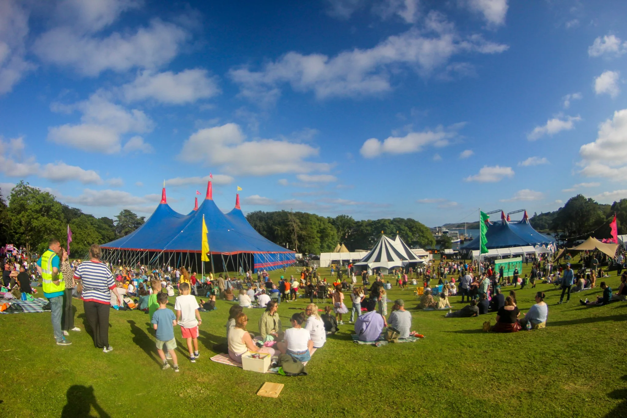
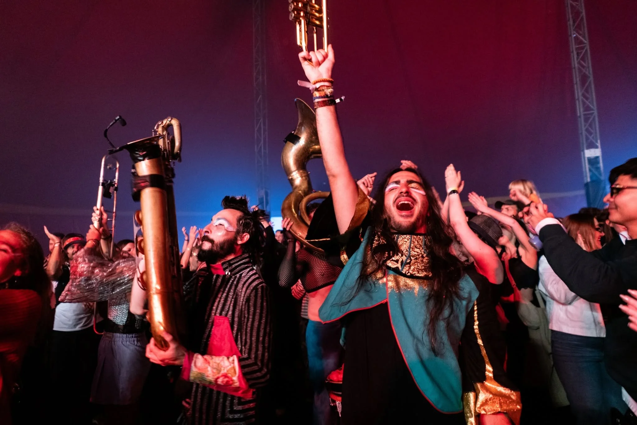
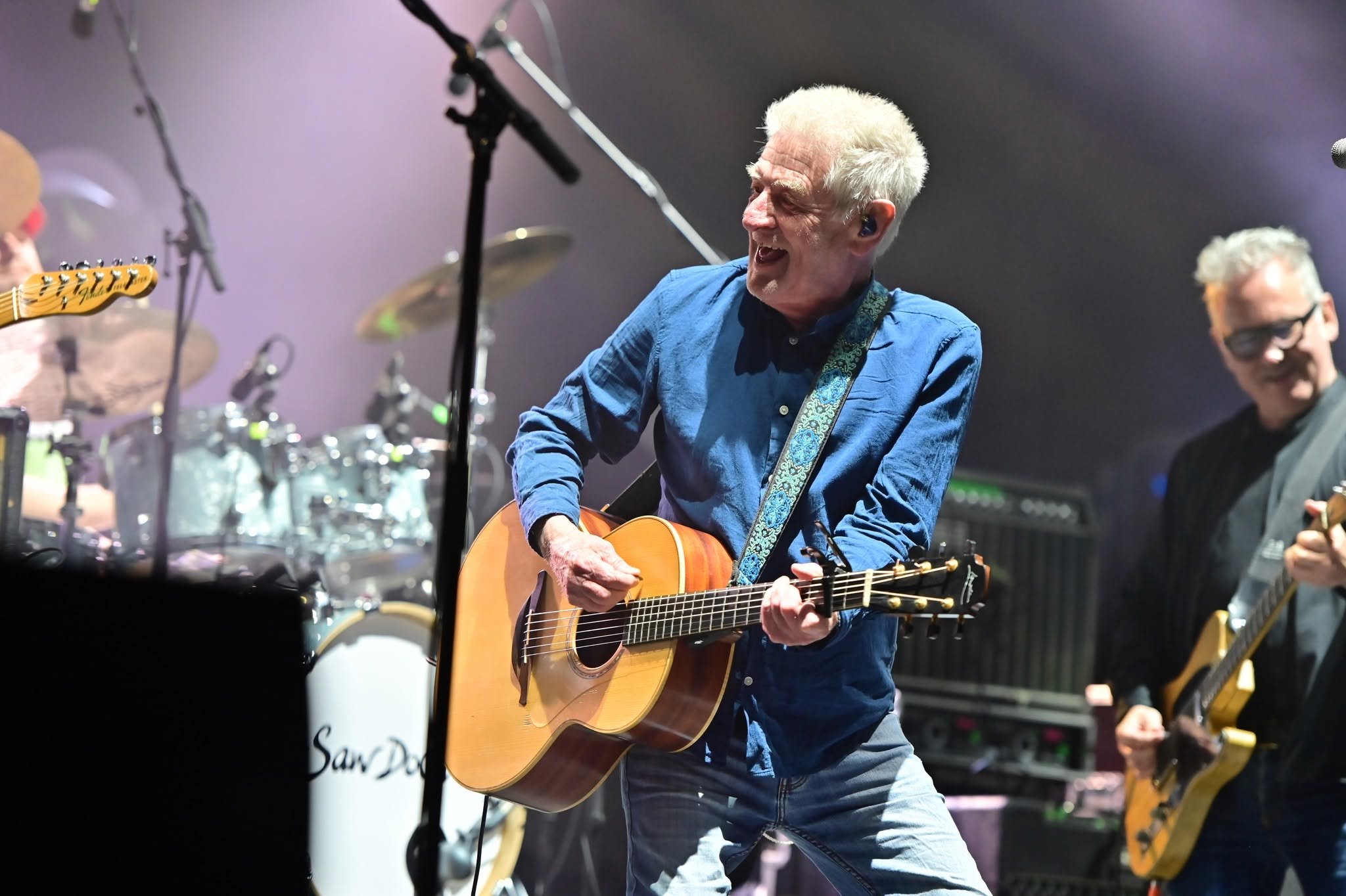
HebCelt 2026 in full swing in Stornoway.
Creating a visual identity for HebCelt 2026 meant knowing when to add more and when to add less.
HebCelt is one of the biggest dates in the Isle of Lewis calendar. Held in the grounds of Lews Castle in Stornoway, the annual Celtic music festival brings artists and audiences from across Scotland and beyond to the island.
It is also a festival with a strong sense of place. The music matters, of course. So do the landscape, the light, the community, and the feeling of stepping into a temporary village full of good people and great tunes.
HebCelt is Scotland’s third-largest music festival and is approaching its 30th year. For 2026, the brief was familiar in some ways. I was still helping the team create a flexible visual identity to work across the full festival experience.
But the creative response needed to move forward.
Rather than building on the decorative, illustrative direction I developed for 2025, I wanted to explore a simpler and more adaptable visual language. That became the starting point for this year’s work.
I shaped the project around my W.I.S.E process: Wonder, Ideas, Shine and Equip.
Here’s how it came together.
1. Wonder
Wonder is where I step back and understand what the project needs to do.
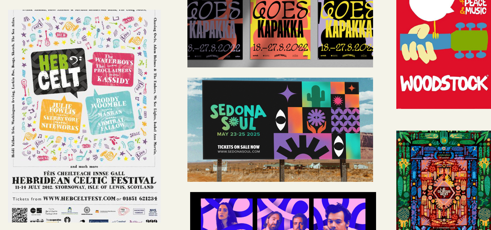
In the discovery phase with the HebCelt team, we looked at where the festival was heading after a huge 2025 and what identity needed to be handled across print and digital.
The previous visuals were rich and illustrative. They worked well, but for 2026, the strategy was to simplify.
That meant cutting back on visual elements so the music, place, joy, and energy could come through more clearly.
It also meant moving away from detailed illustration and towards flat iconography. A simpler icon system would be easier to scale, rearrange and apply across everything from social media to pint cups and festival wristbands.
For me, strong visual identity design is rarely about adding more. It’s about choosing the right elements and letting them work harder.
2. Ideas
Once the strategic direction was clear, I moved into the Ideas stage.
This is where I allow the work to open up a little. I explore different routes, test the tone and look for the idea that has enough strength to carry the whole campaign.
I presented two main concepts to the HebCelt team.
Idea one: bold shapes
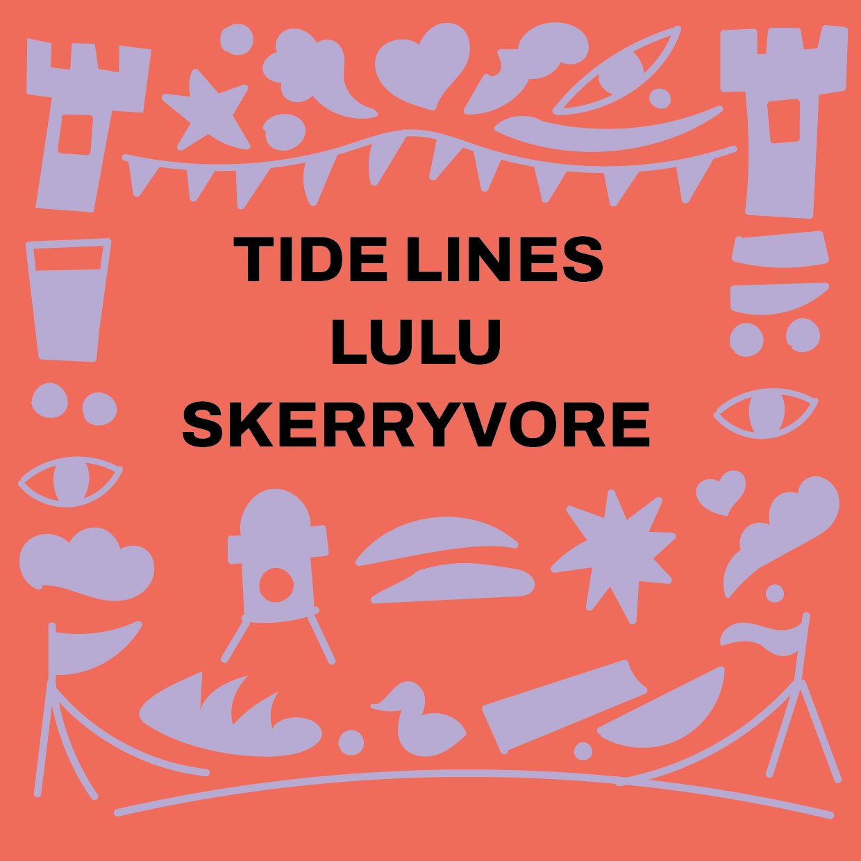

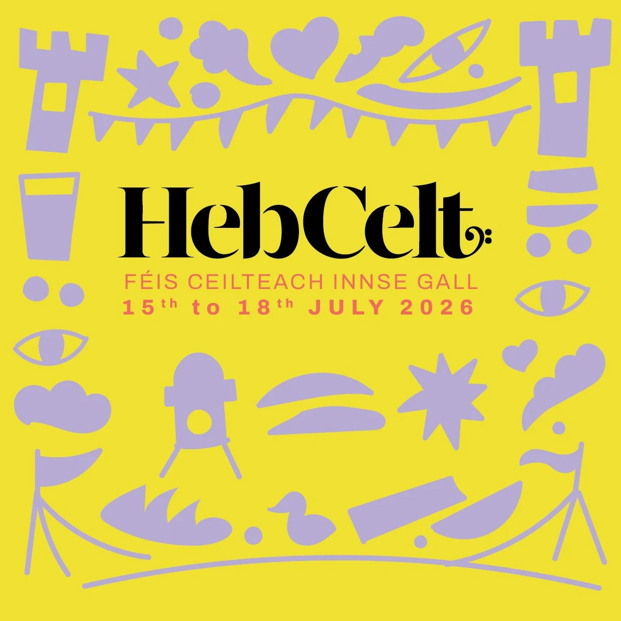
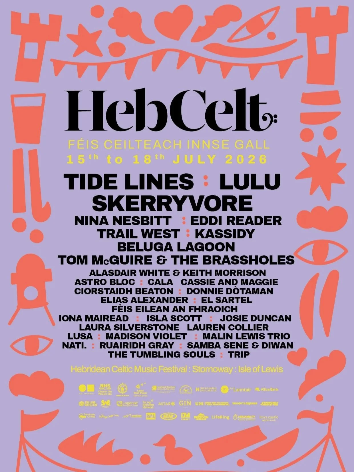

The first route used bold, minimal, slightly abstract shapes inspired by music, the island landscape, the castle, tents, movement and the changing sky.
It was designed as a flexible graphic toolkit. The shapes could work as single icons, grouped compositions or repeat patterns across print and digital. The challenge was keeping them simple without letting them feel generic.
Idea two: photography and scribbles
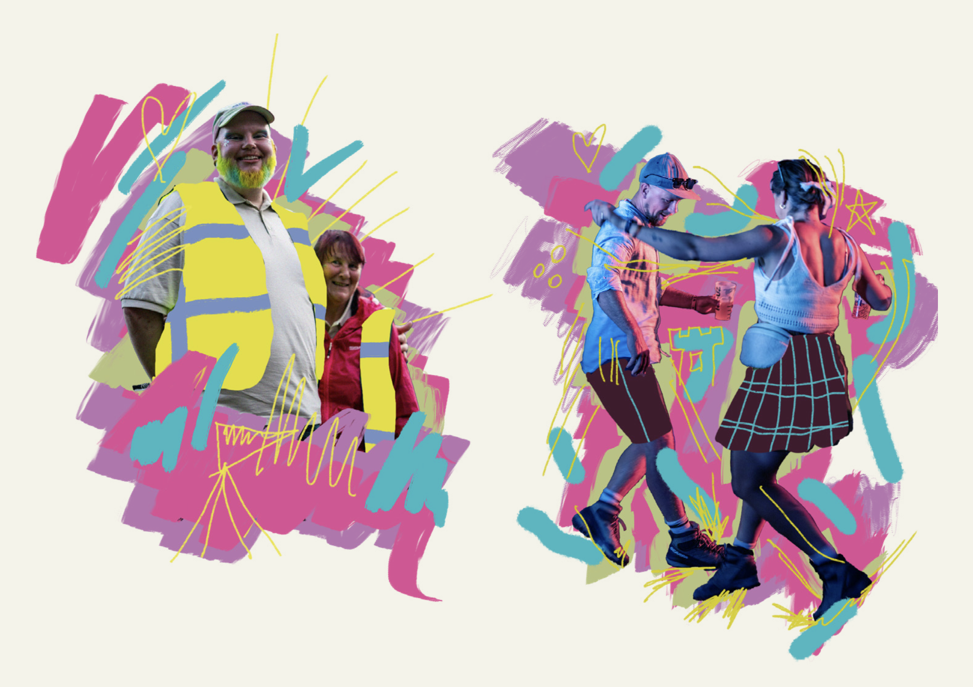

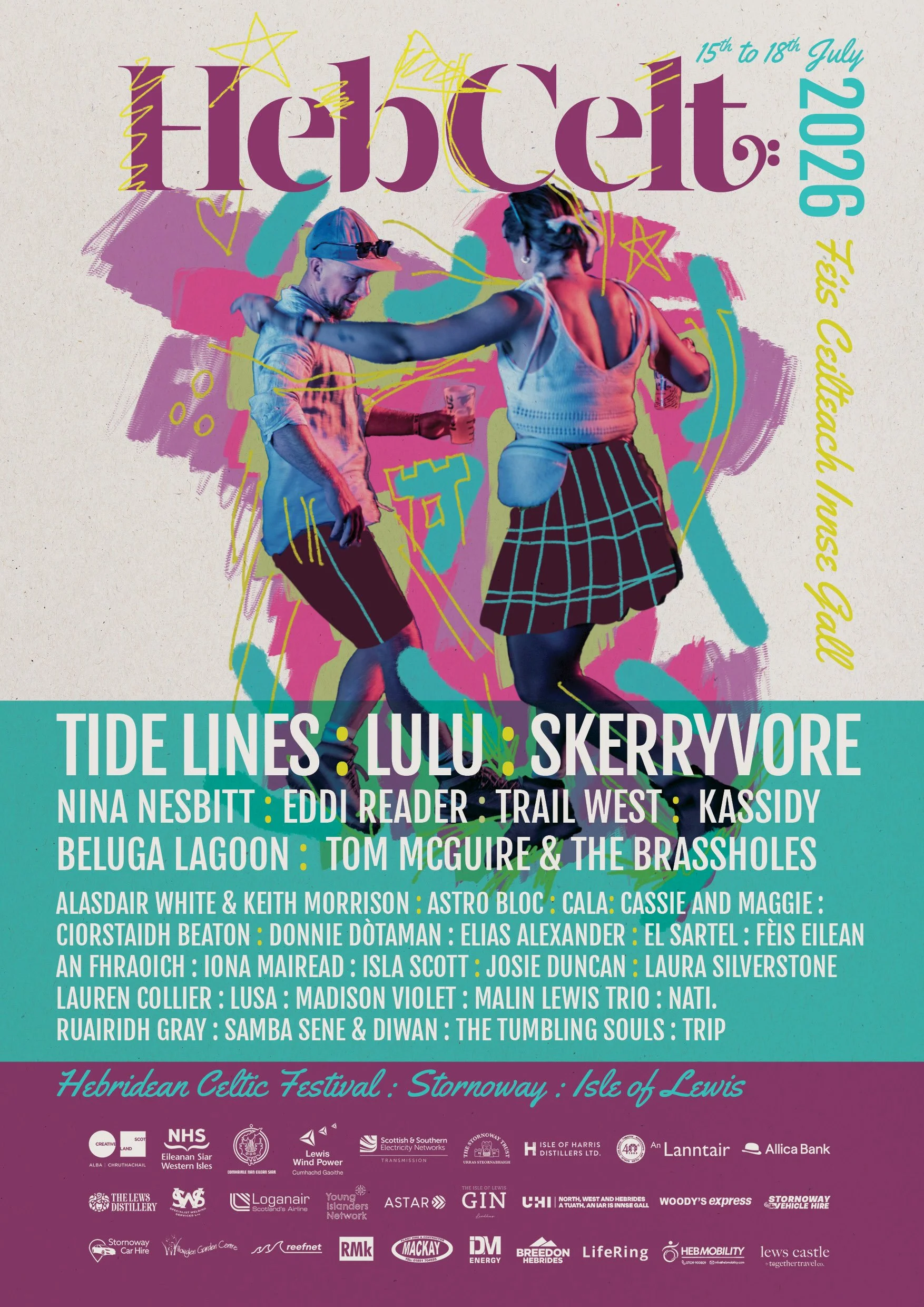
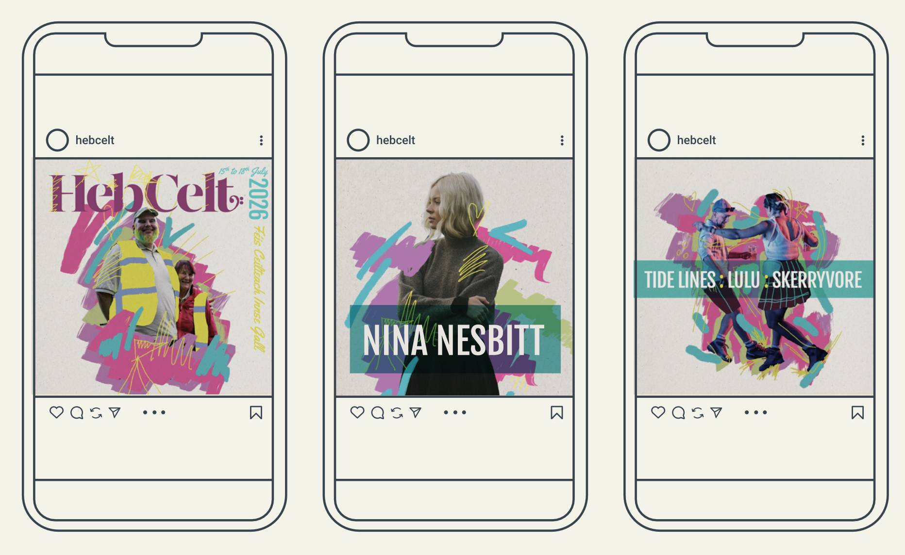
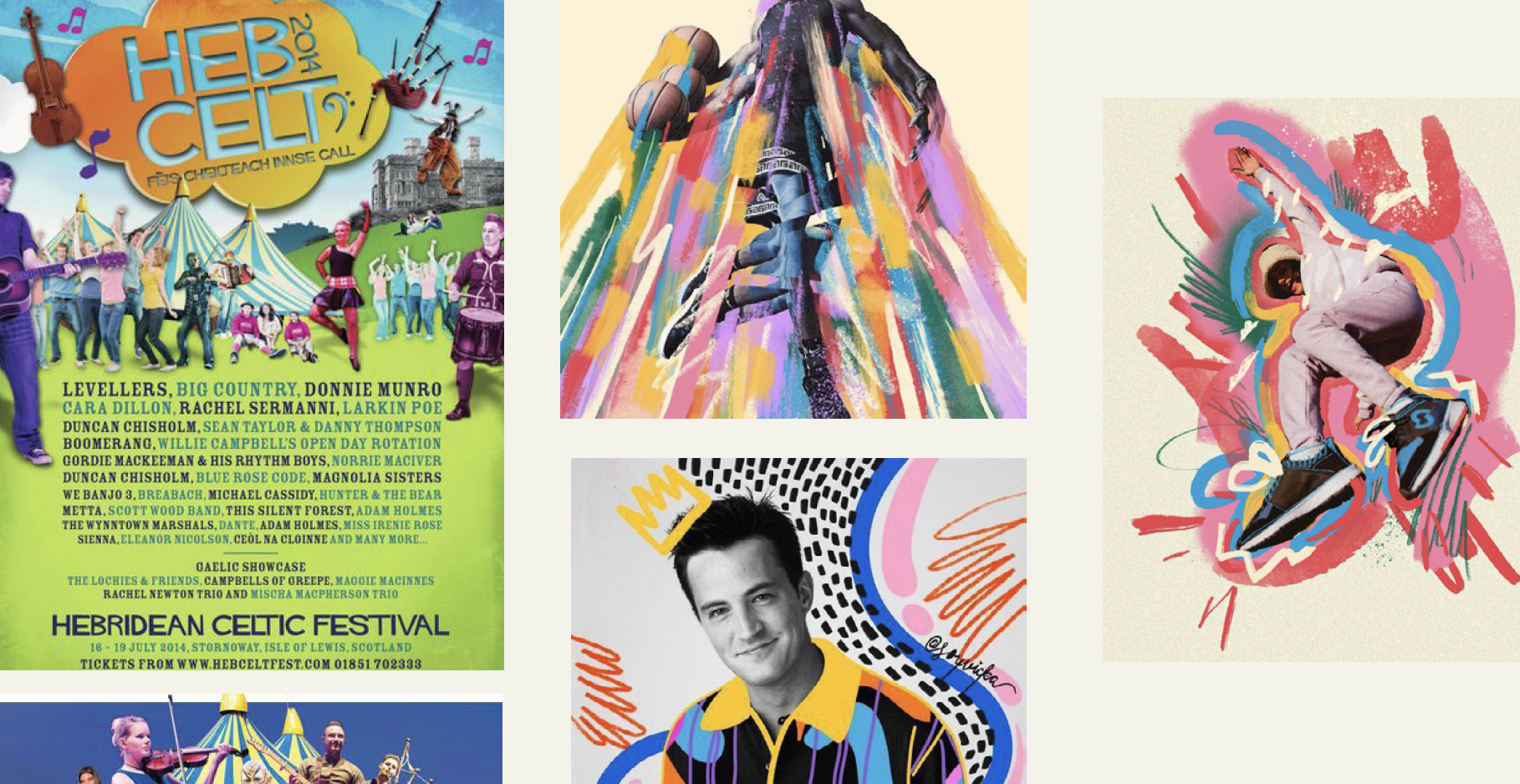
The second route used festival photography with loose, lively scribbles layered on top.
This approach felt more immediate and editorial. It brought people and atmosphere to the front, with the scribbles adding movement and spontaneity.
Both ideas had something to offer. One was stronger as a graphic system. The other leaned into human energy. Showing both gave the HebCelt team something real to react to, and that helped the best direction emerge.
3. Shine
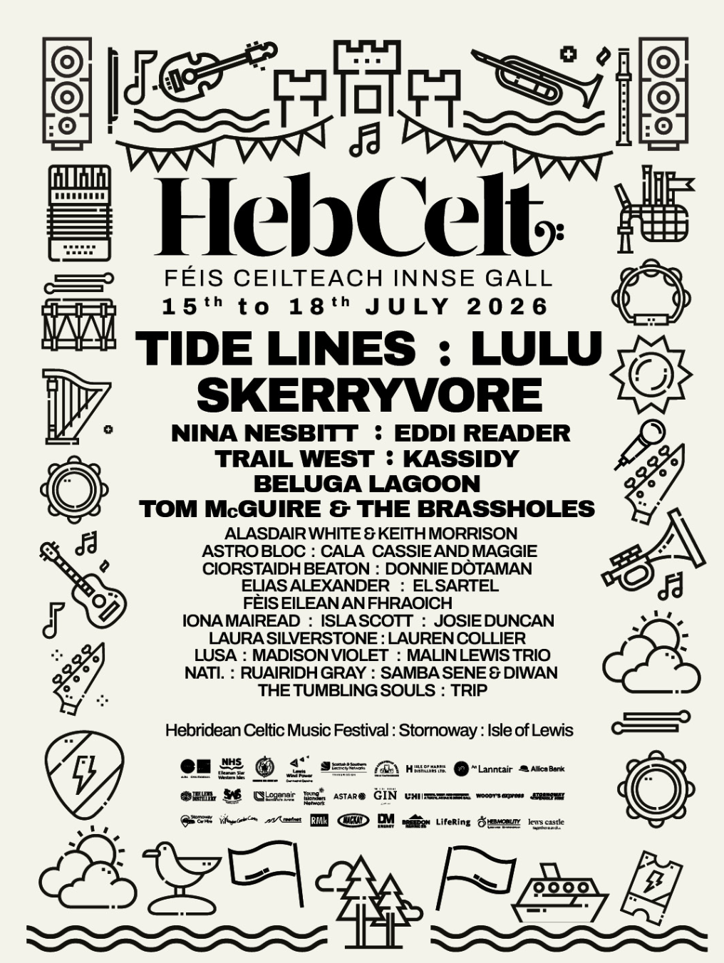
The HebCelt team chose the bold icon route, and Shine was about refining it.
The key move was making the icons less abstract and more fun. I introduced clearer references and more playful details so the symbols were easier to recognise while still feeling clean and graphic.

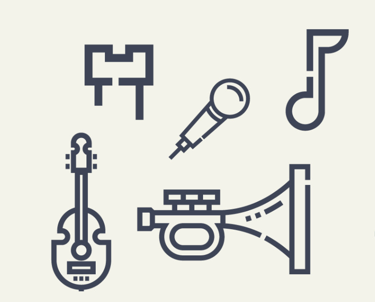
That balance mattered. The system needed to be distinctive, flexible and welcoming.
Colour then helped the route really land. I developed a multi-coloured gradient inspired by the Hebridean twilight, drawing on the blues, purples, pinks, oranges and deep greens you get in the island evening light.
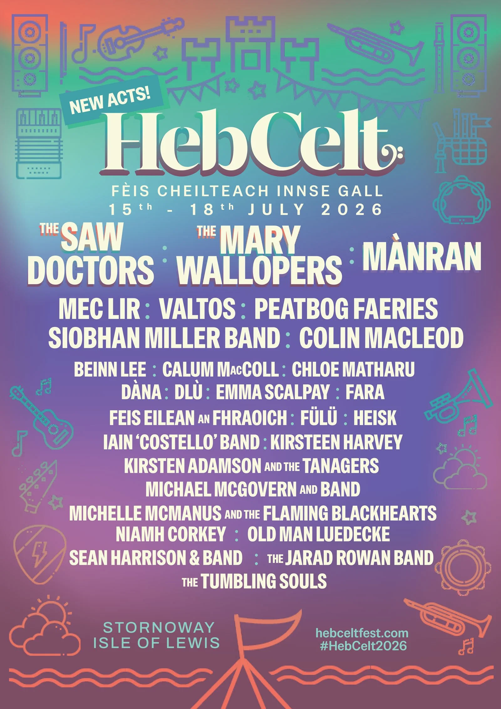
That gradient brought warmth and atmosphere without adding complexity. Combined with the flat icons, it created a visual identity with structure, personality and a strong sense of place.
The chosen route developed into a flexible system of friendly icons, bold colour and simple graphic compositions.
There’s still a place for detailed vector illustration in my work, but for HebCelt 2026, simplicity gave the campaign more room to move.
4. Equip
©HebCelt Festival
Once the direction was approved, the identity moved into production. This is Equip: the stage where the system starts working in the real world.
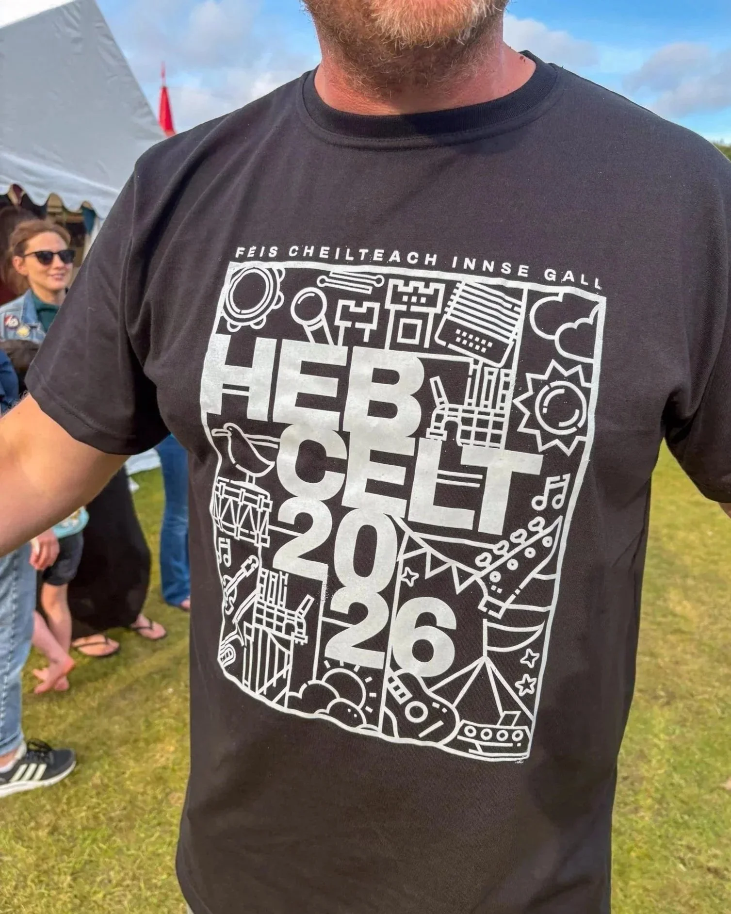
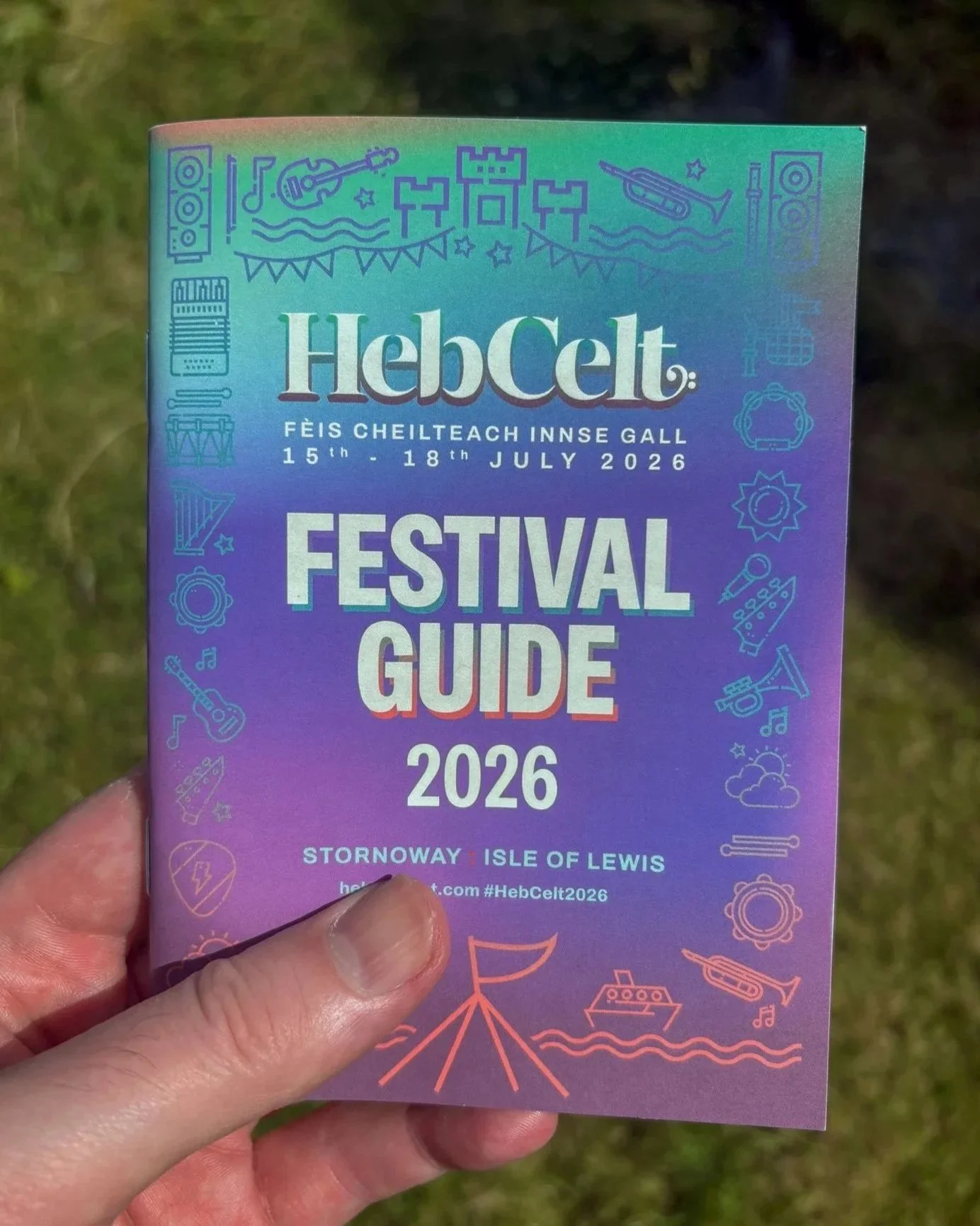
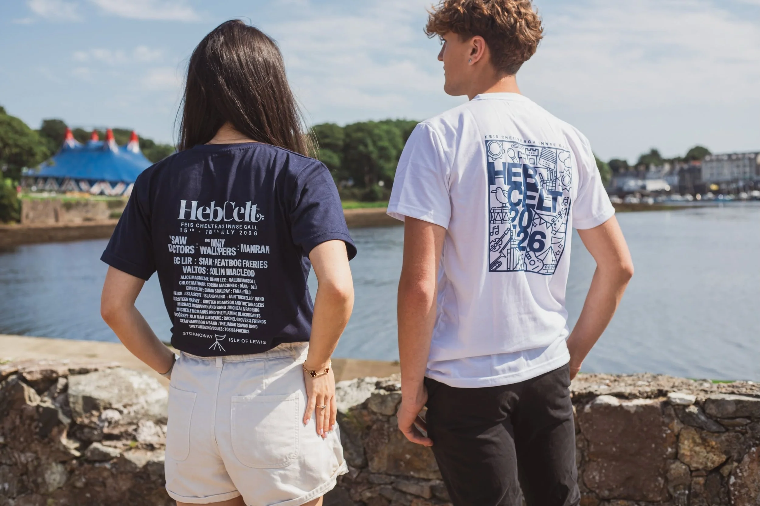
I developed the main HebCelt 2026 communications across:
Festival wristbands
Festival Guide
Posters
Social media content
Pint cup artwork
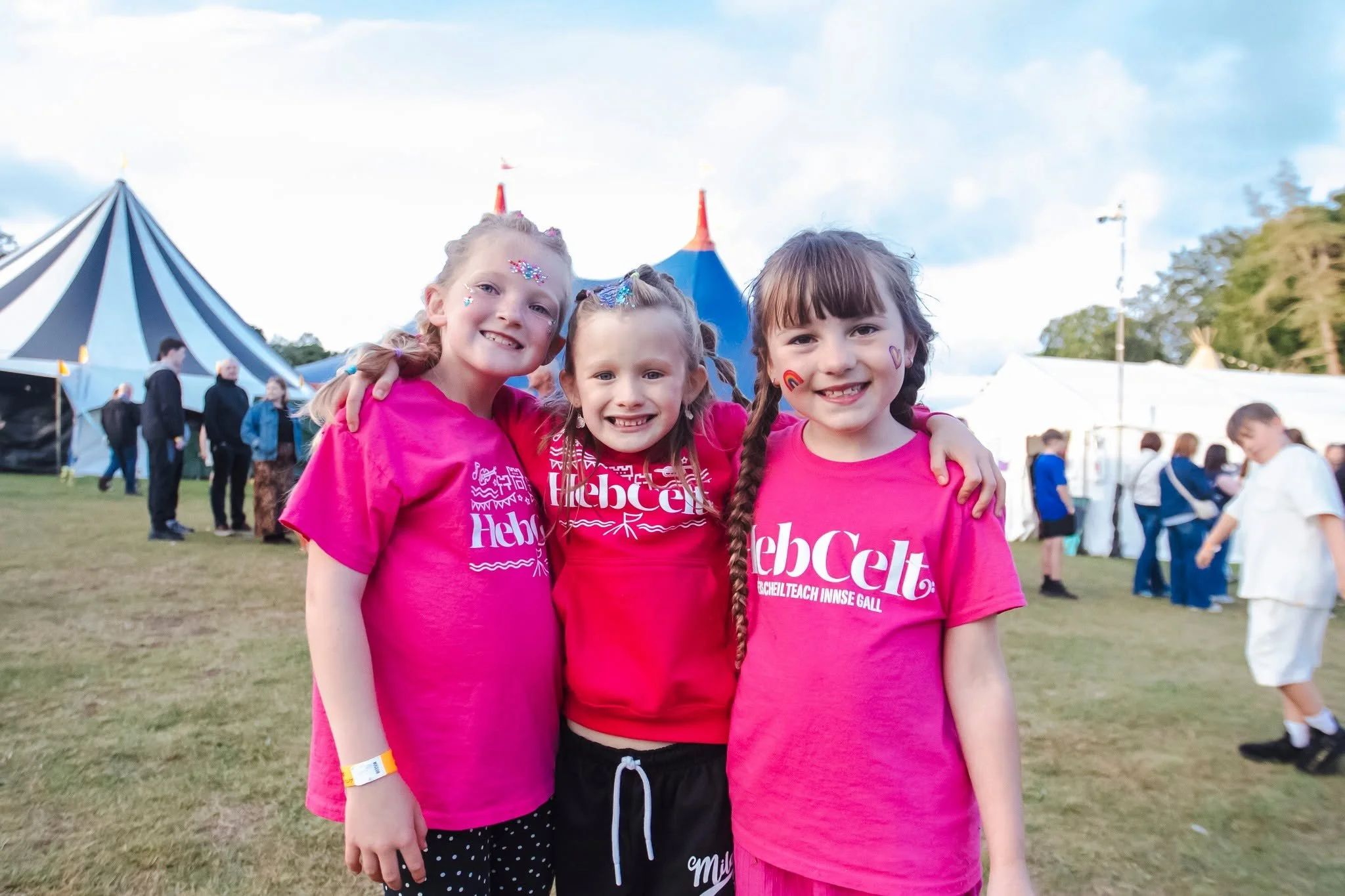
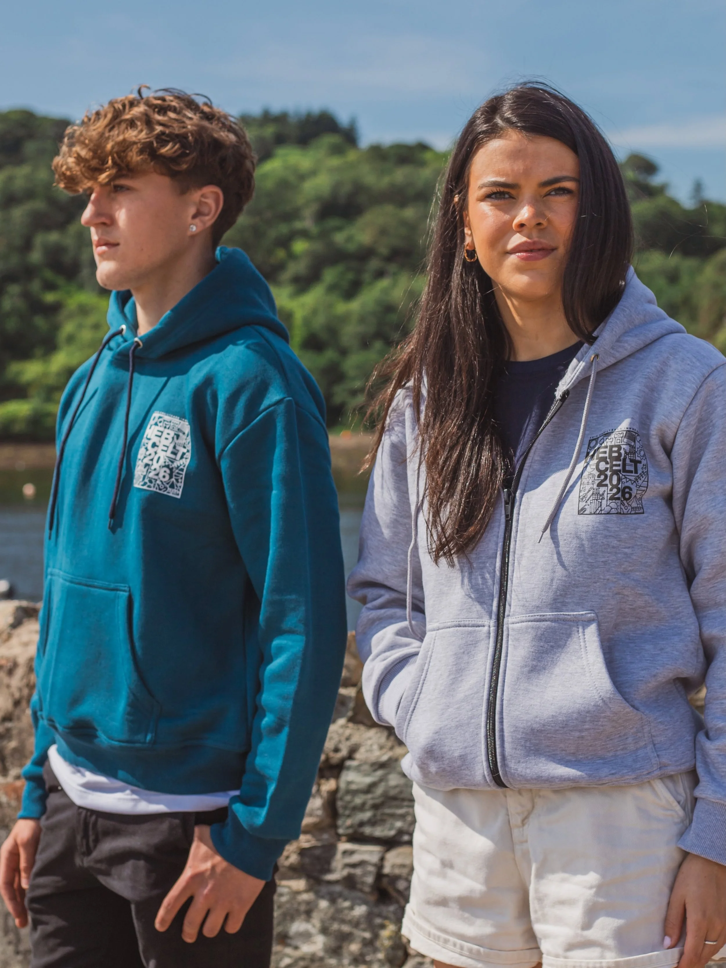
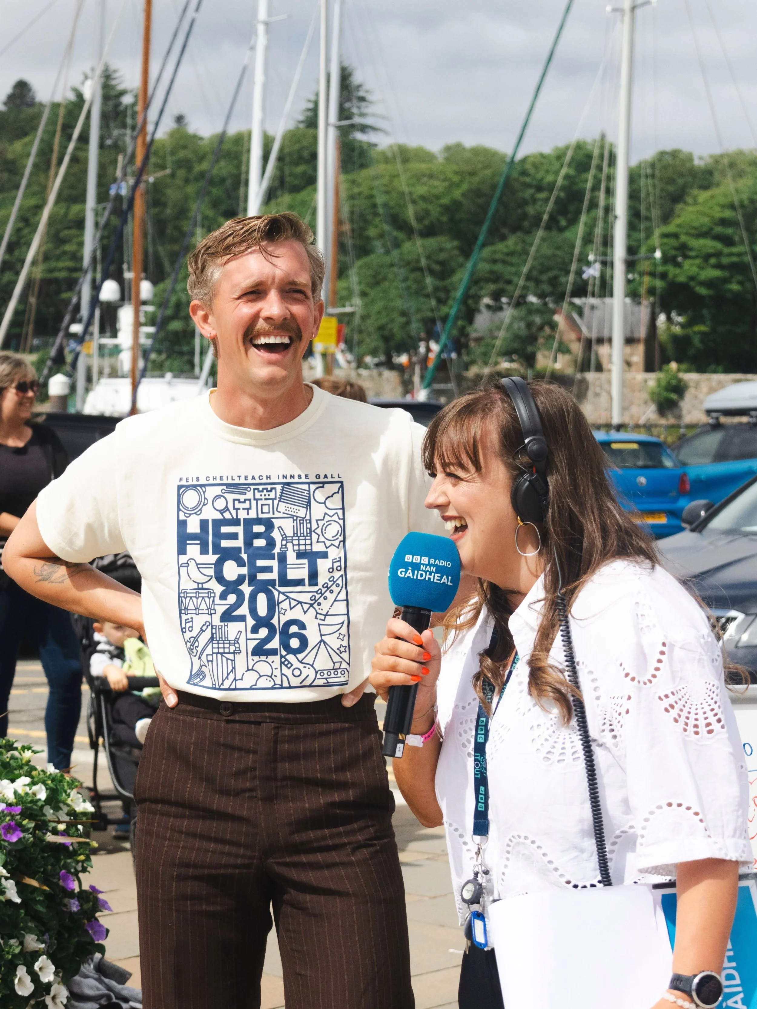
Merchandise
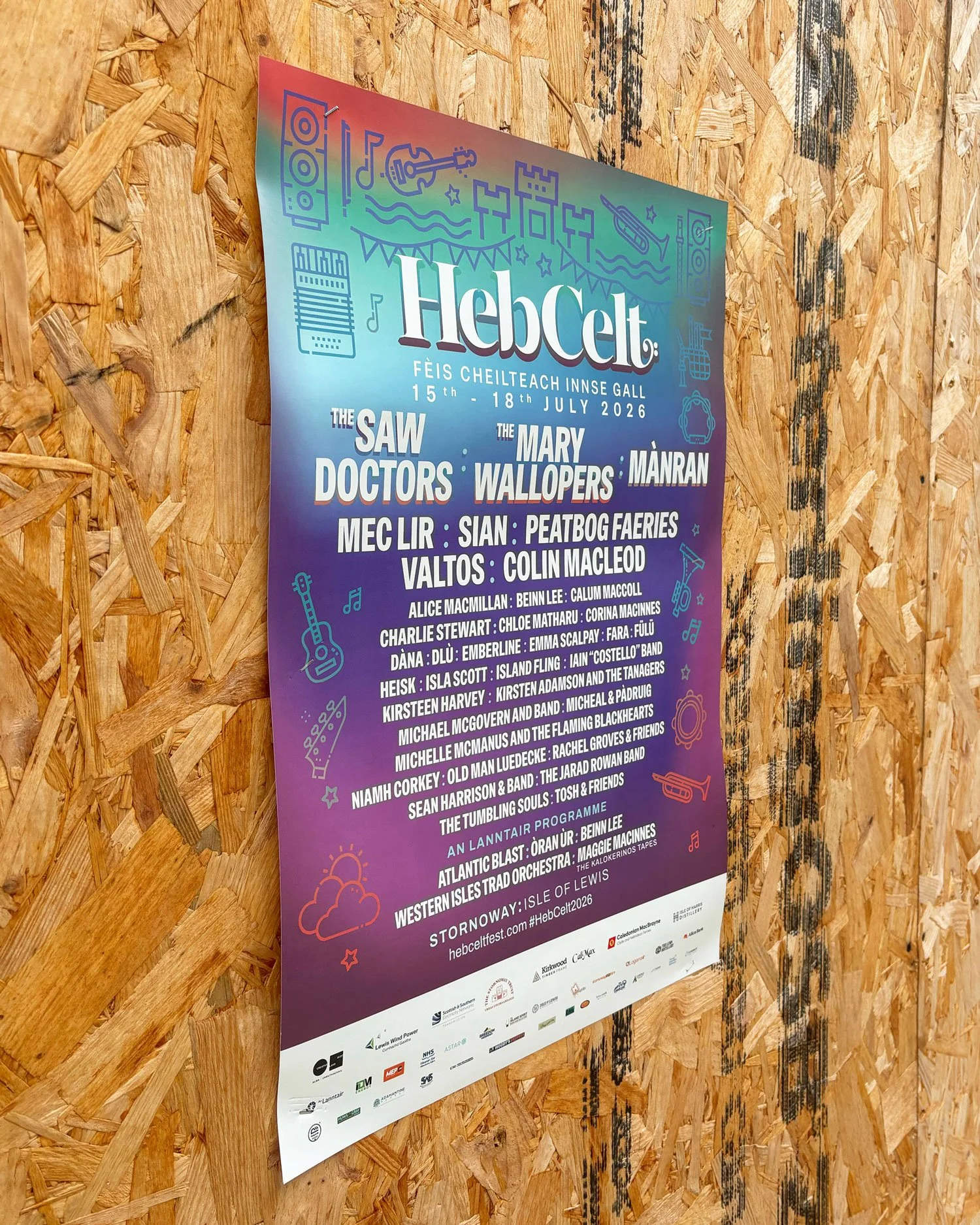
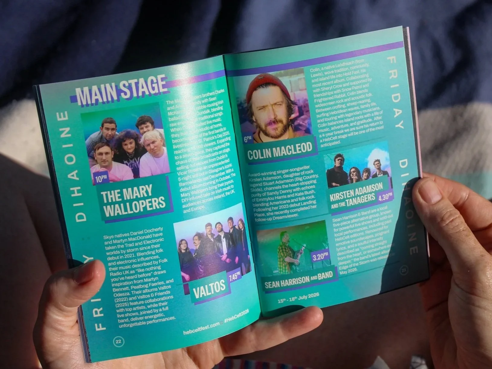
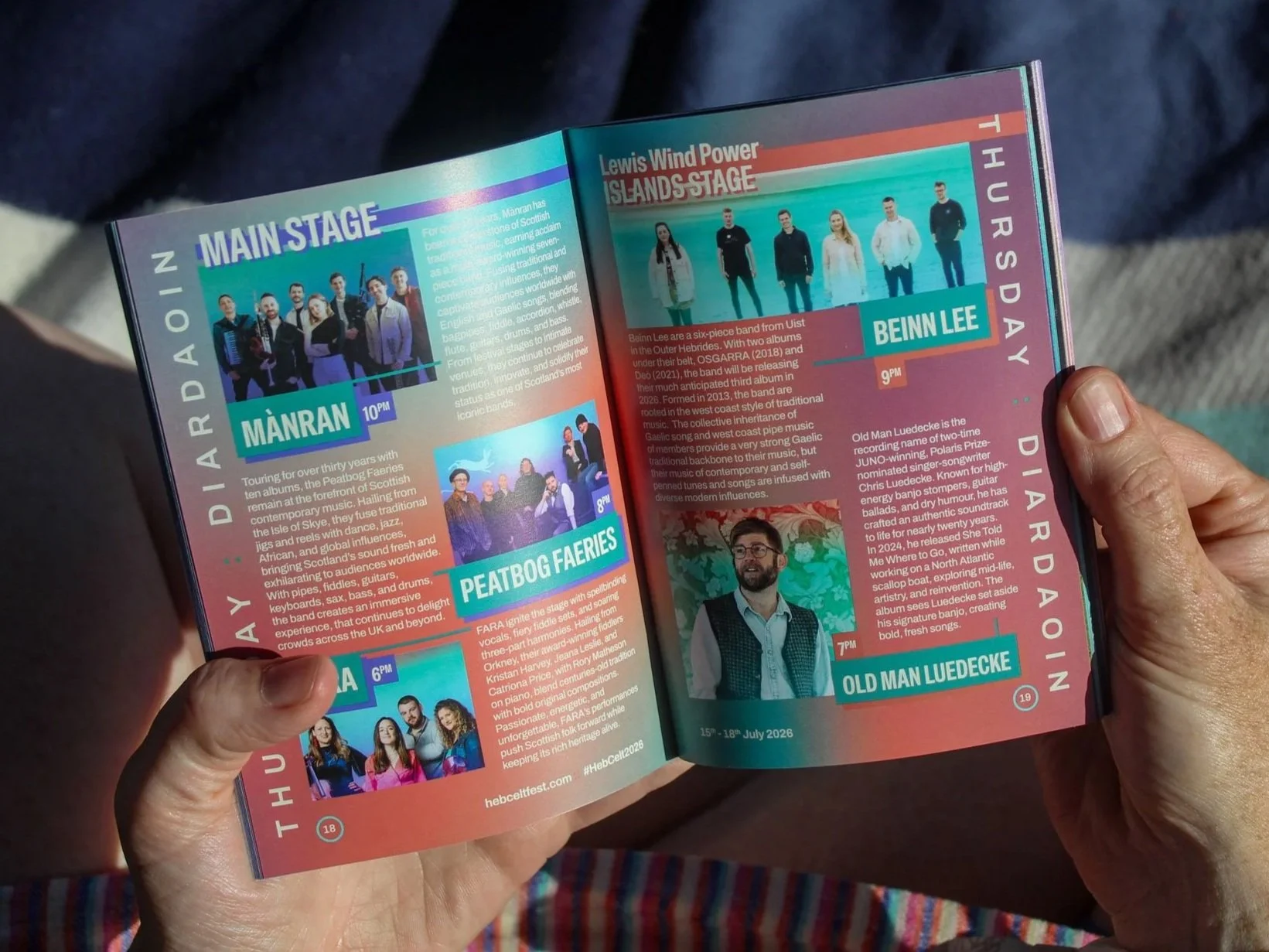
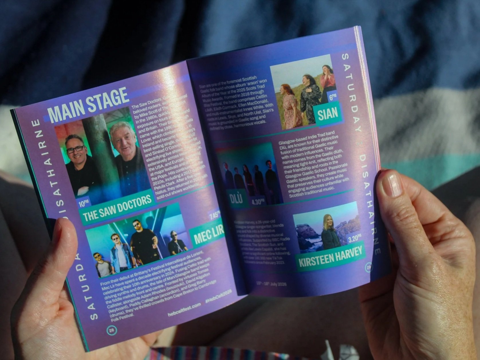
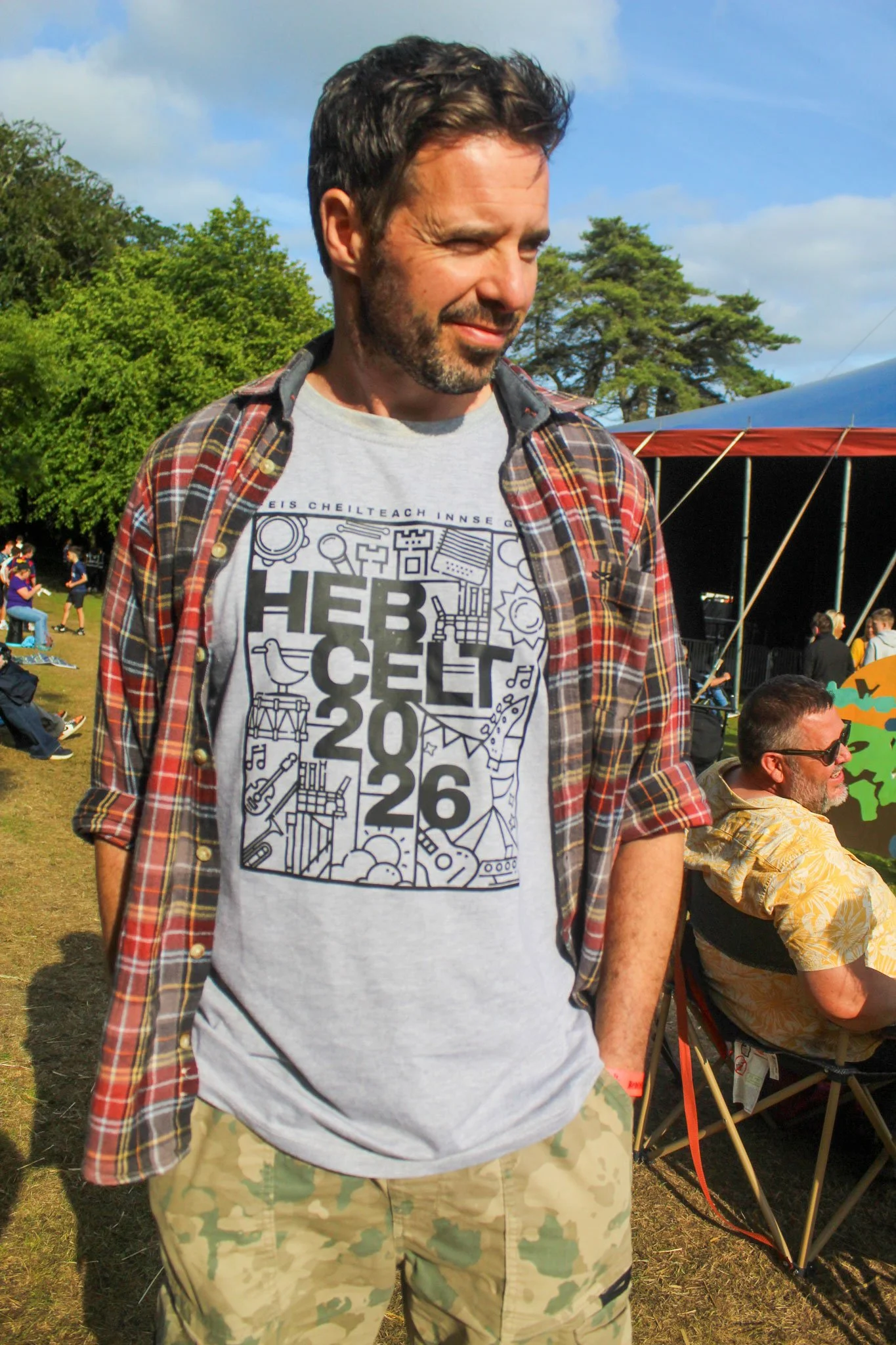
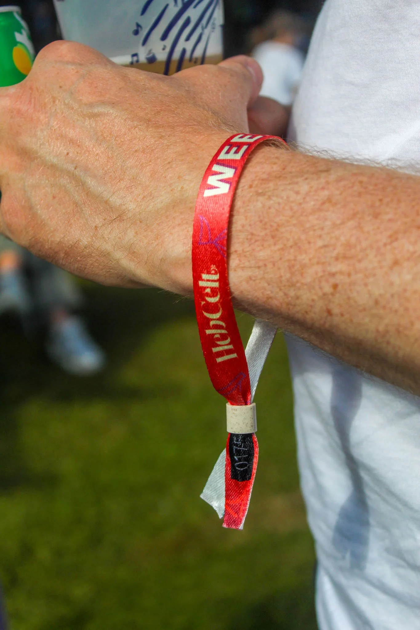
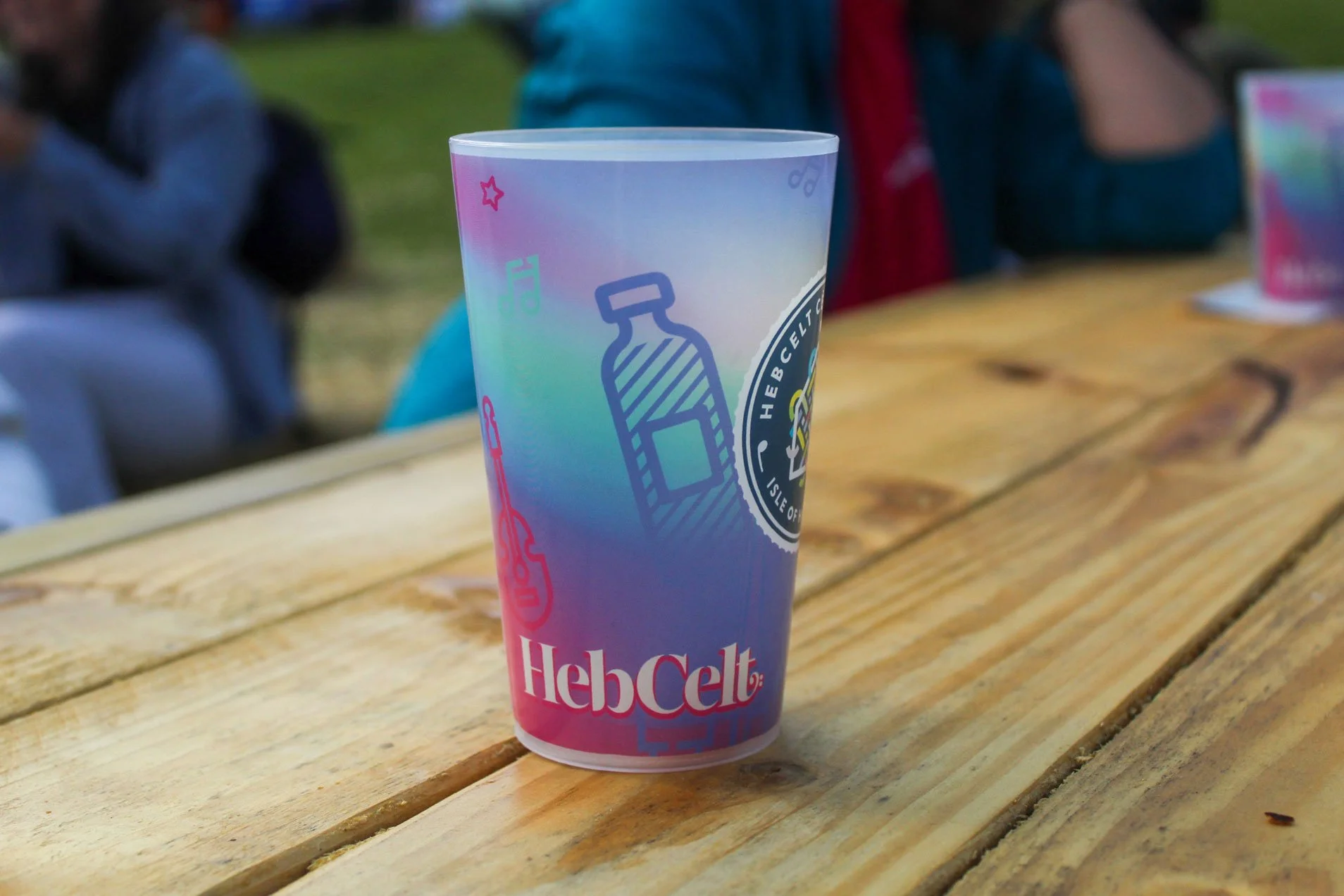
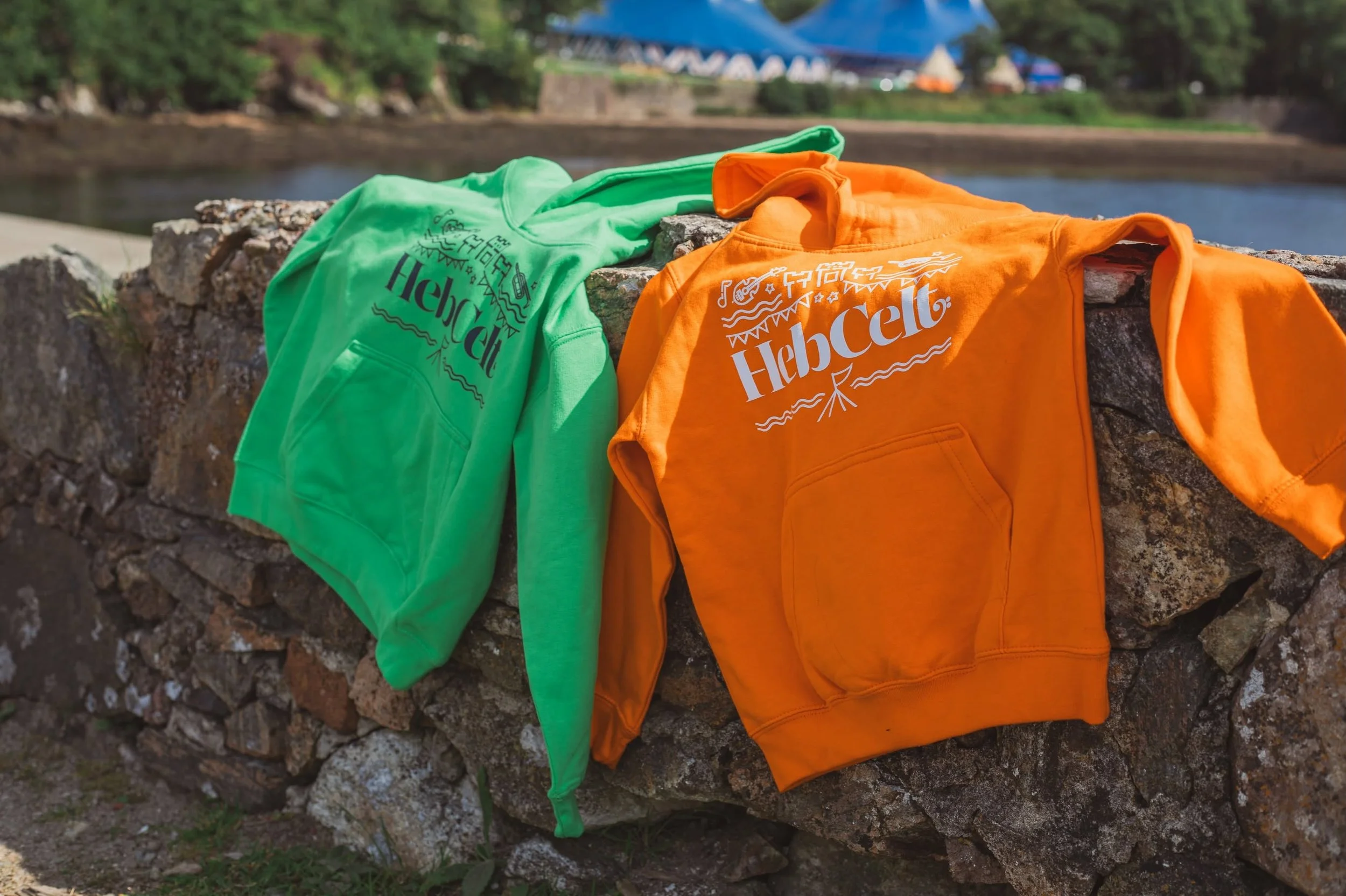
©HebCelt
Each format had different demands, but the same identity needed to hold together across all of them.
That’s where the system proved its value. The icons scaled cleanly, the gradient added variety, and the overall look remained recognisable across screen, print, and product.
This is also where my experience in print design comes into its own. I enjoy the practical side: artwork setup, production thinking, and making sure the final result works beyond the screen.
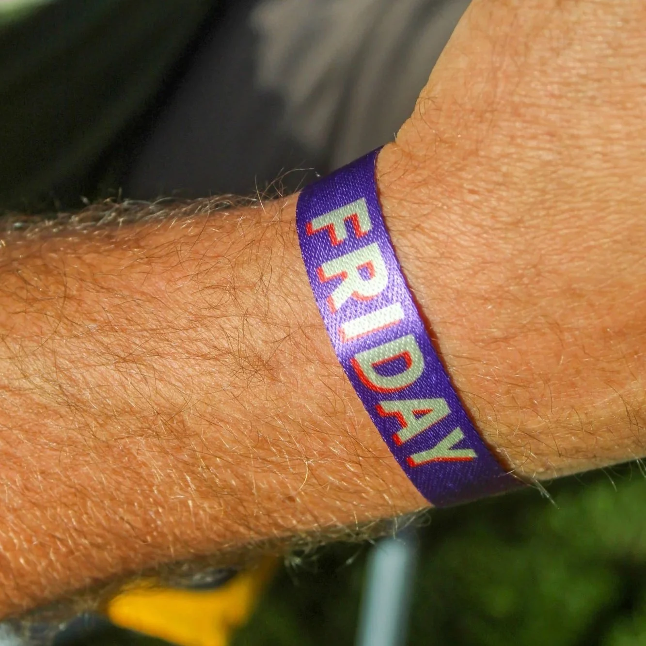
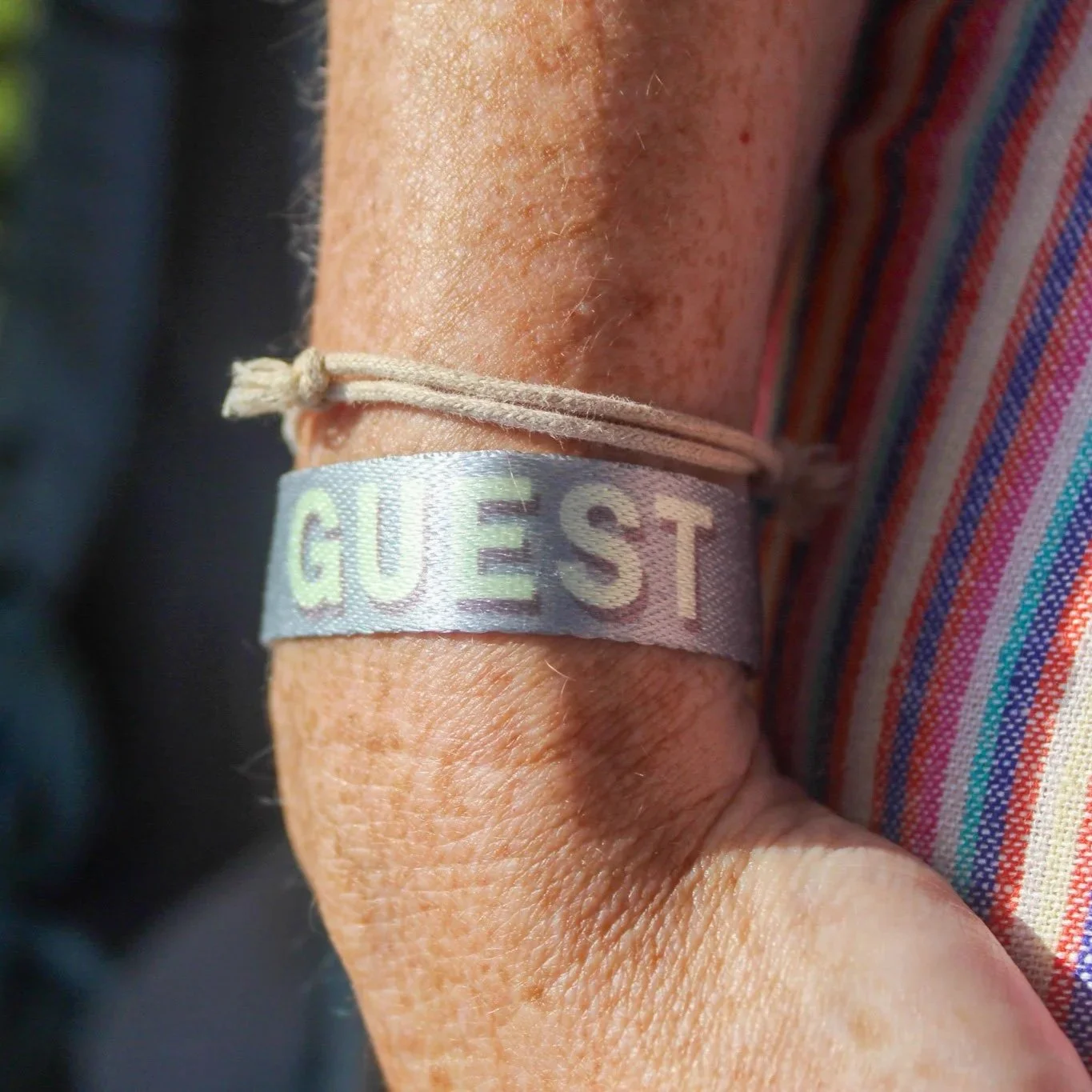
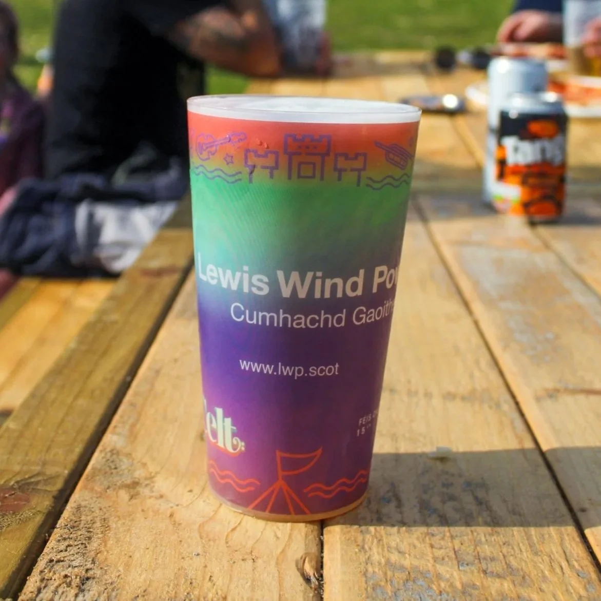
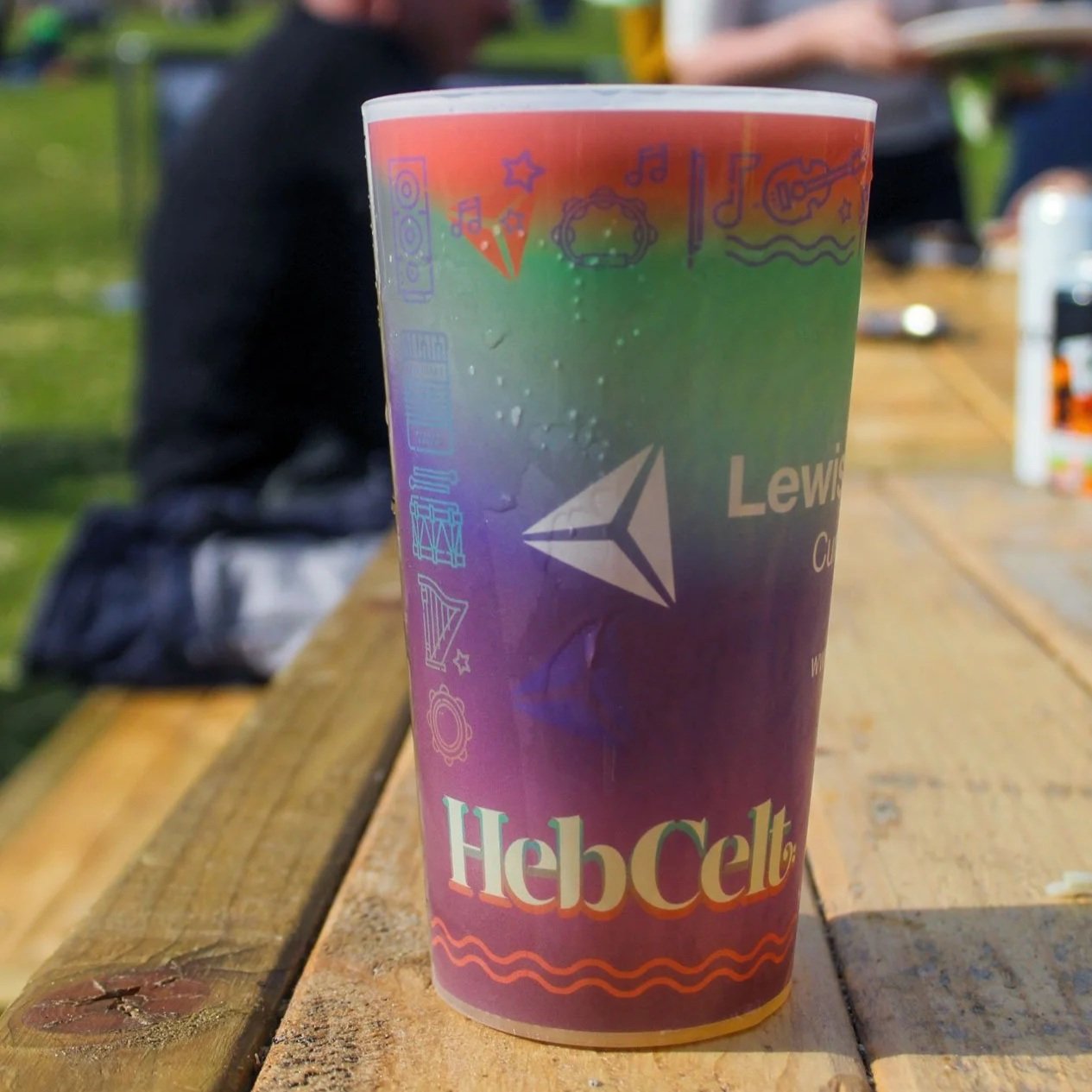
©HebCelt Festival
©HebCelt Festival
Stephen Libby from the Traitors! ©HebCelt Festival
“From the first concept to the final touches, Pearse brought creativity, passion, and a deep understanding of the HebCelt spirit to every element of the design. He’s been such an important part of the team.”

I’m grateful to the festival team for trusting me with another year of the project.
If you’re looking for help with brand identity design, campaign design, graphic design
or print design, BOOK A CALL TODAY!
File under