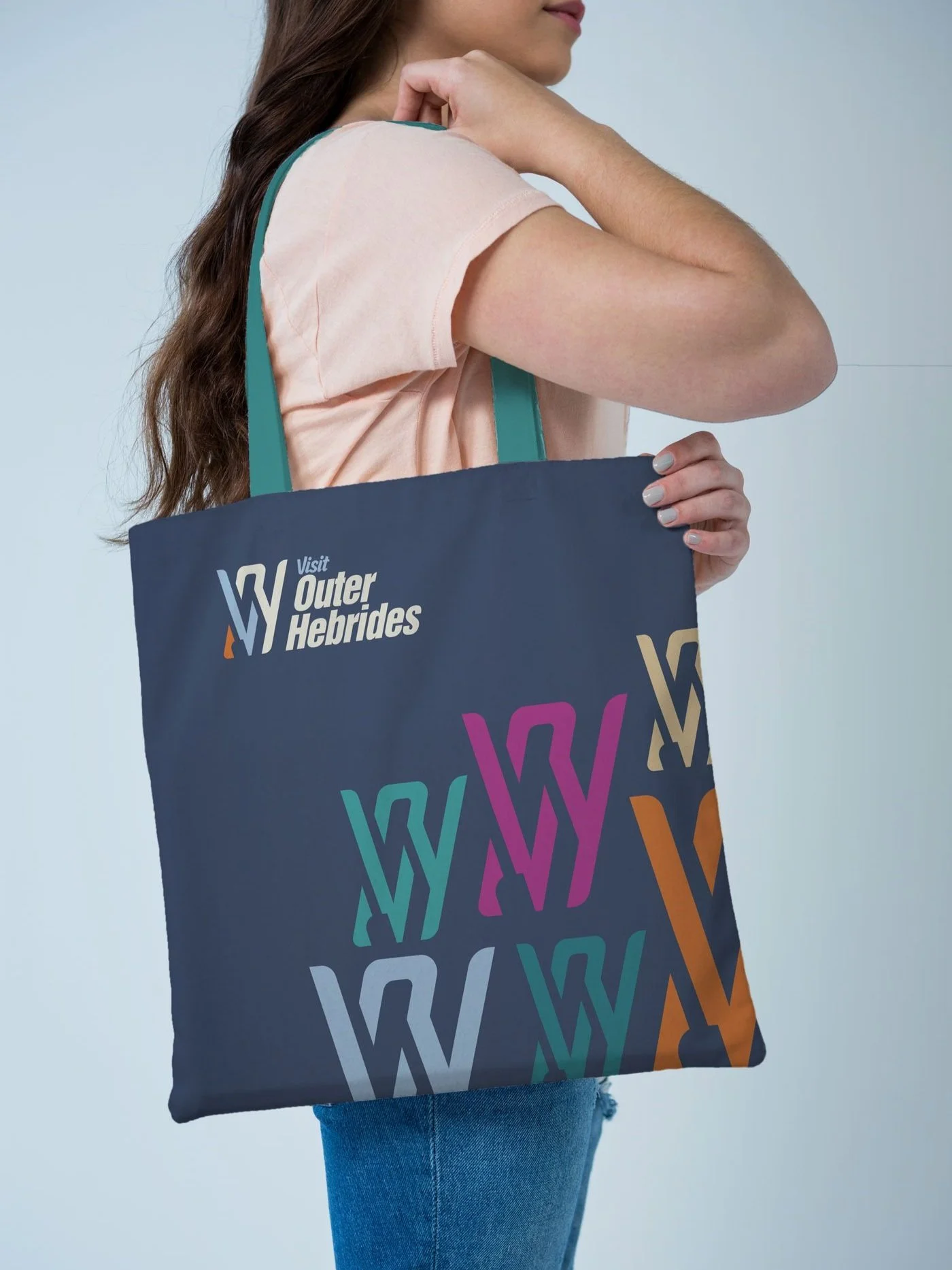
Visit Outer Hebrides Logo
+ Logo Design + Art Direction
Project delivered → March 2025
How do you represent The Outer Hebrides with a logo?
That was the challenge that Visit Outer Hebrides put on me. They sought to reinvigorate their status as a prominent resource for visitors, and it is one of the best places in the world to visit—not just in my opinion but also that of National Geographic.
© Visit Scotland
Phase 1 - Brief
I sat down with the VOH team to establish a full brief for the design. They have used the same logo since rebranding in 2012. The geometric map of the Islands has served them well, but it was time for a new, more considered approach.
The old logo's main strength was how it was readily identifiable as the area. But the map's universality was also its biggest weakness—the Outer Hebrides map was abundant and used so many formats that it was hard to claim it as a unique mark.
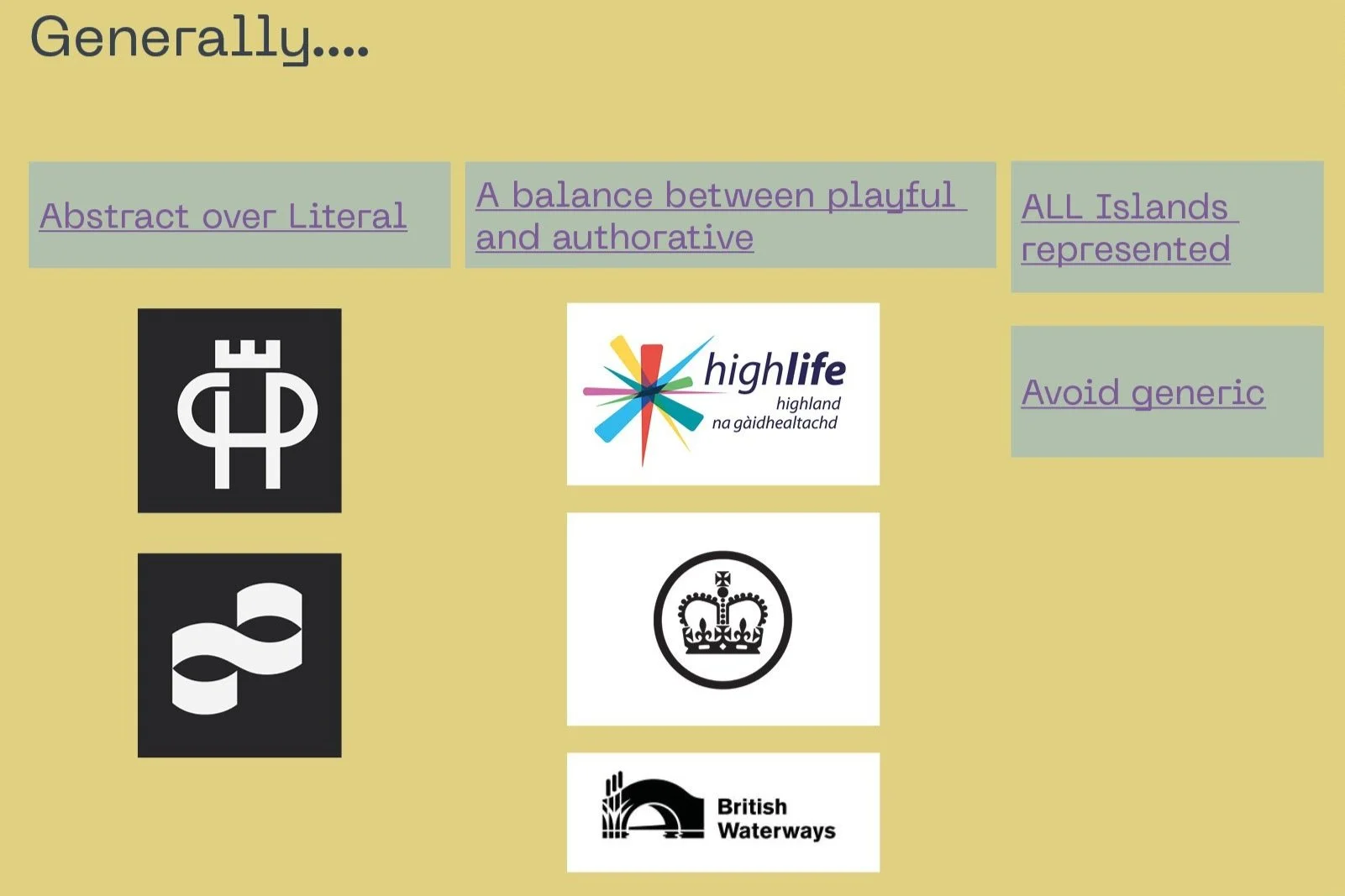
We discussed a wide-ranging suite of visual examples and some clear style parameters were identified:
The logo needed to be authoritative but not so severe that it lacked any notion of fun.
It needed to reflect the joy of Island life positively but not be so playful that we negated its authority.
It needed to be a fresh approach but also fit the current branding.
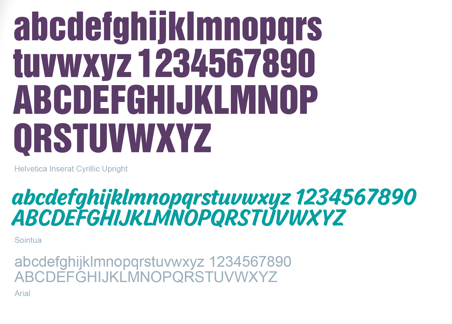
We also noticed that their current brand's secondary font, ‘Carumba’, looked dated and was open to a new replacement.
An initial moodboard of similar organisations
Phase 2 - First visions
The initial discussions were very productive and gave me a solid brief. It was on to exploring visions for the shape and feel of the logo.
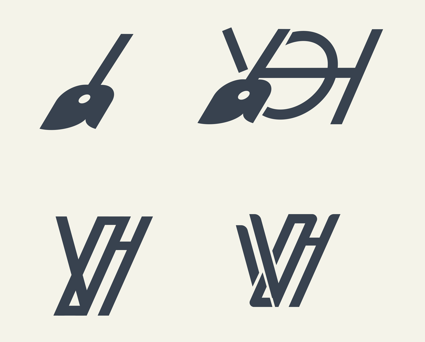
The islands were such a broad subject that my research spanned history, geography, and wildlife. I also looked at abstract representations by zooming in on landmarks, sculptures, and the hatching of Harris Tweed.
From my initial sketching, some solid routes began to form. I developed these into presentable concepts to show to the team.
Again, we had very healthy discussions about the direction when presented with the concepts.
The more abstract forms were closer to the mark than some literal interpretations. The way the abstract forms could suggest many elements was appealing. They also made for more unique and distinctive marks.
“The more abstract forms were closer to the mark than some literal interpretations.”
Phase 3 - Final refinement
From that final meeting, I saw a definite route toward the final logo. The next phase was about refining the mark until we had the perfect balance.
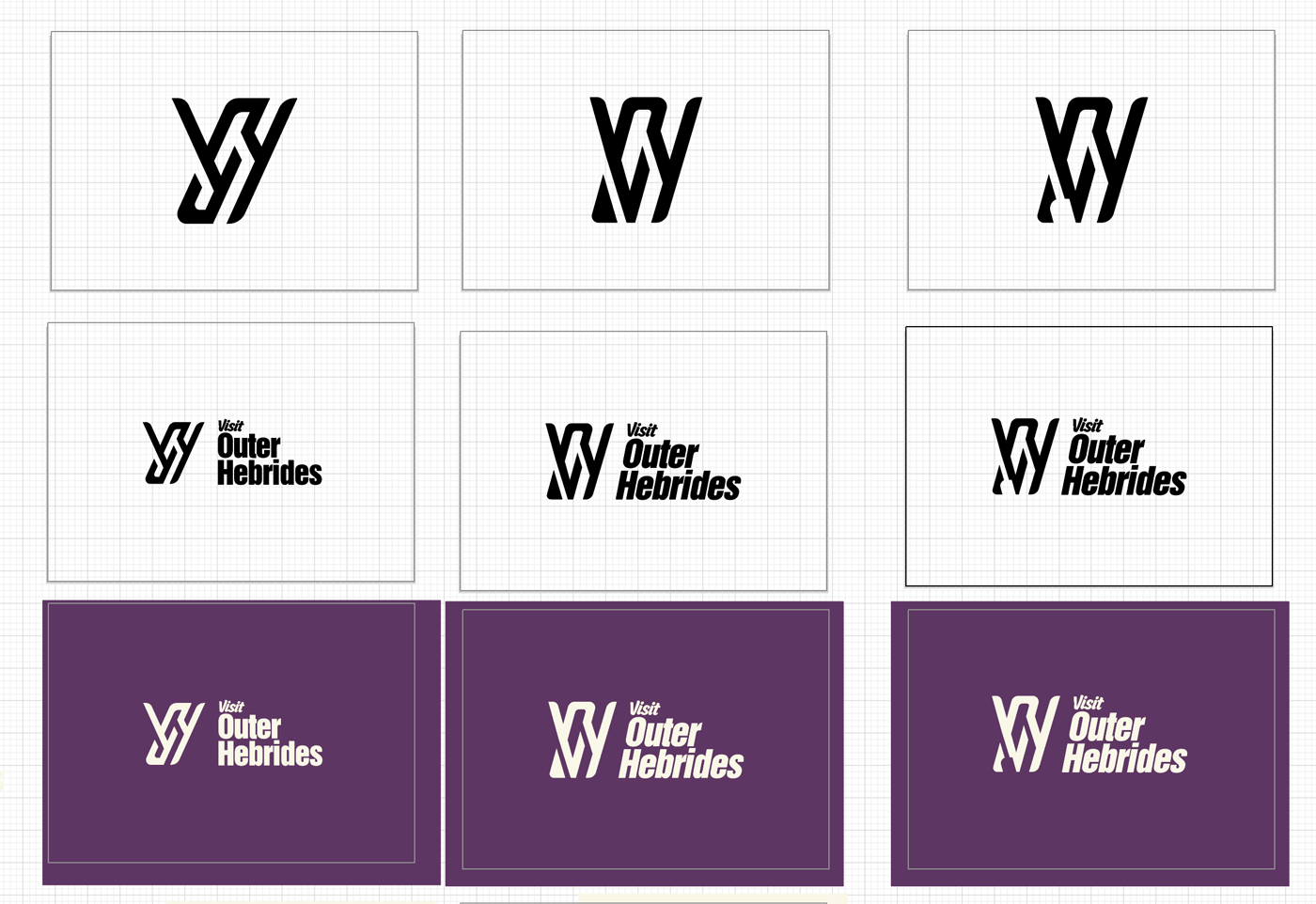
At this stage, I try different weights of strokes and arrangements, adding or removing lines until I feel we have the optimal format.
Final layout explorations of the final logo
The final logo is suggestive of the oars of historical Birlinn boats, the weave of Harris tweed and the wild wind that blasts the Isles, all framed in the letters 'V-O-H'.
I also introduced the ‘Sointua’ to the brand to replace 'Carumba’ as the secondary font.
Phase 4 - Output
The final phase included outputting the new logo in various print and digital formats for the team to use, including motion versions.
The design process left us with decisions that affected the current brand. Some new and updated style guide pages were needed to define elements that complement the new logo.
Some of the existing sub-brand logos also needed to be refreshed to further complement the brand shift.
Application
“When we set out to achieve an update of the Visit Outer Hebrides logo we were very mindful of the old adage ‘if it ain’t broke, don’t fix it’ – the previous map logo served us well and whilst we were confident it was time for something new we were very anxious about getting it right.
Having worked with Pearse on design projects in the past, we trusted that he knew our organisation and would bring creativity and sensitivity to our brand refresh.
We brain-dumped ideas and asked Pearse to filter these down to find the best, and that is exactly what he did, bringing them to life and melding them with new design elements we hadn’t considered. We’re delighted with the end product, which at one level is a clean and simple representation of our title letters, yet is evocative of so many details that define island life.”
Sarah Maclean | CEO
Visit Outer Hebrides
Thanks for stopping by…
If you need a refresher of your brand, I have space in my diary. Hit ‘BOOK’ below, or drop me an email at hello@pearseohalloran.com
File under


