WiseNoise: Kirsten & Alex on making room at the table.
Alex De Sousa - Founder of the Edible app
Kirsten Murray - Brand Strategist and Creative Director
WiseNoise 11 features food allergies, brand strategy, ADHD, print marketing, and why the best creative work usually starts long before the logo.
This episode of WiseNoise felt like a proper full-circle conversation.
Kirsten and Alex first met at Edinburgh College. Alex was studying design, and Kirsten was his mentor. Years later, Alex got back in touch and asked Kirsten to create the brand strategy and identity for Edible, the food-allergy platform he had first envisioned as a student.
So this wasn’t simply a designer talking about a project. It was a designer and founder talking openly about how they worked together. That made the conversation especially interesting to me.
It also gave us plenty to talk about: ADHD, mascots, logo design, self-promotion, print marketing, and the sometimes complicated relationship between designers and clients.
Watch Kirsten & Alex chat about the Edible story ↓
A lifelong problem becomes a design project
Alex has lived with food allergies all his life. He started with around 14 and now has roughly 28.
When he was young, his parents managed the questions and conversations around food. As he got older, that responsibility shifted to him. That was when he realised how difficult eating out could be.
In the UK, the minimum legal requirement for businesses is verbal disclosure of allergen information. In practice, that can mean asking questions at the table, waiting for someone to check with the kitchen, receiving an answer, and then asking several follow-up questions.
Alex compared the experience to a game of whispers. The original message can become distorted as it passes from person to person. What you say can be interpreted differently by the person trying to find the information, and then differently again by the person explaining it back to you.
The frustrating part is that restaurants often have the information. When Alex worked in a restaurant from around 16 to 20, he saw that the chefs were generally happy to accommodate customers. The real problem was getting accurate information out of the business and into the hands of the person who needed it.
And how are you supposed to know whether somewhere is suitable before you leave the house?
That’s the problem Edible is trying to solve.
Edible aims to make allergen information clearer and more useful before customers arrive at the table.
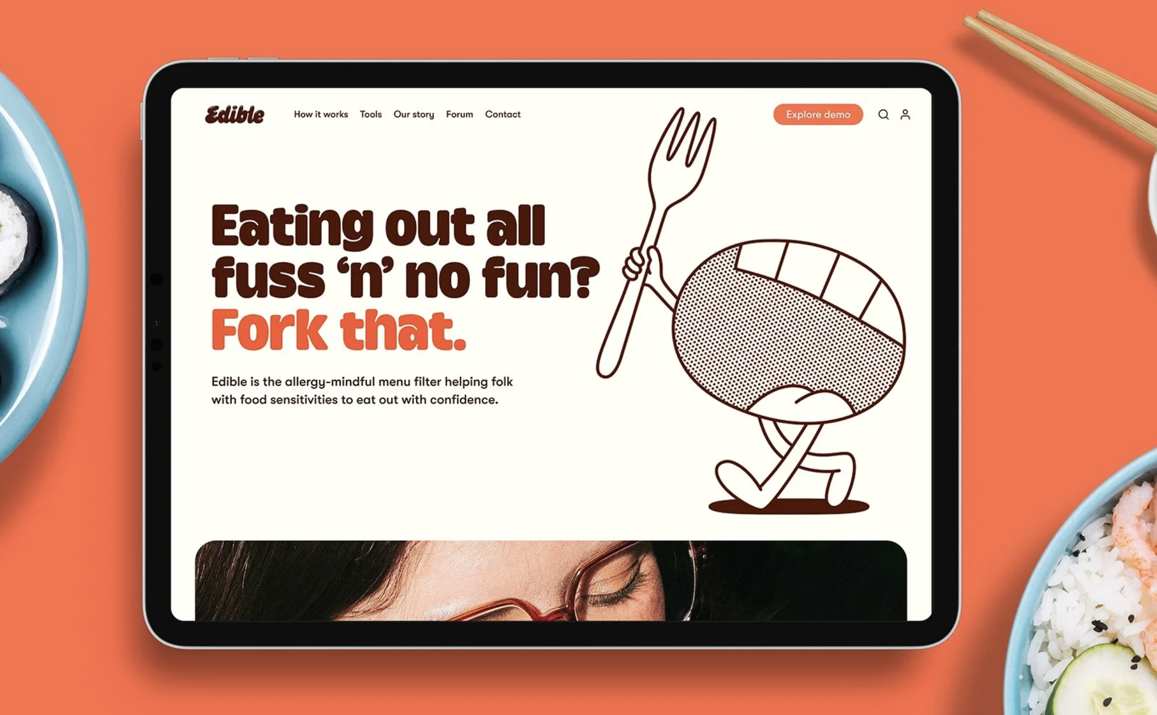
Landing page of the Edible wesbite featuring the brand mascot ‘Nom’.
Making the world more edible
Edible works from both sides.
For businesses, it provides a tool for inputting allergen information without requiring them to work out the best way to present it. For customers, it makes that information available before they leave home, in a form that makes sense for them.
Alex and the team have also built the ability to photograph allergen information in whatever form it currently exists and turn it into a personalised, pre-filtered menu.
That matters because allergen information can arrive as numbered lists, lettering systems, icons, spreadsheets, or separate sheets that need to be cross-referenced at the table. The business decides how the information is displayed. Edible is trying to give some of that control back to the customer.
The bigger ambition is a search and discovery platform: a map showing what is available nearby, with user-submitted allergen information alongside businesses verified through Edible.
The idea began as Alex’s final project at design school. He then parked it because he knew he didn’t yet have the skills to make it happen. After five years working in a small agency in Toronto, specialising in digital design, e-commerce, apps and websites, he came back to it.
Before building the product, Alex put stickers on lampposts in Edinburgh and Glasgow asking whether eating out with allergies was a “pain in the peanuts”. A couple of hundred stickers generated close to 500 responses.
That is a brilliant piece of low-budget, physical research. It also proved that the problem was shared by many people.
Strategy before the logo
Kirsten felt enormous pressure when Alex asked her to work on Edible.
He had once been her mentee. She felt she had to live up to the role of mentor and produce the best work of her life. Thankfully, the process was smooth because Alex arrived with a clear vision of what Edible needed to be, who it was for, why it existed, and how it could benefit people.
Kirsten’s job was to communicate that clearly and interestingly.
One of the central ideas was Edible’s mission: make the world more edible.
It works as a statement of purpose, but also as a call to action. You can make a restaurant more edible. You can make your own world more edible. It is language that can speak to both businesses and customers.
Kirsten also pushed beyond the usual one-word brand values. Words like “trust”, “community” and “transparency” are useful, but they can mean almost anything.
Edible’s values became more specific:
To be a source of clarity
To make room at our table
Those phrases describe what the brand actually does. They also belong to Edible’s world in a way that generic values never could.
The two audiences received their own value propositions too. For businesses, Edible would serve peace of mind. For customers, it would help them eat out with confidence.
That strategic clarity gave the rest of the brand somewhere to go.
For Edible, the logo came after the wider brand world had been established.
Food bandits, NOM and big spoon energy
Kirsten and Alex personified the 14 major allergens as “food bandits”. These villains had been cast away from many diets, but could still cause serious harm if they found their way into someone’s food.
The concept allowed them to address a life-and-death subject with a degree of lightness. The bandits could be banished with daggers, stickers and playful visual scenarios. Eventually, phrases such as “peace out peanut”, “so long sesame” and “ta-ta tofu” became useful sticker lockups for the website and social media.
Then came the hero: NOM.
NOM is a mouthy mascot who can act as a guide, a foodie, and an activist. Kirsten explored how a character can express emotion without relying on a full face, and worked with illustrator Ant Gardener to take the mascot from rough sketches to its finished form.
I particularly enjoyed Kirsten’s point that a designer doesn’t need to be a brilliant illustrator. Your sketches only need to be good enough to communicate the idea.
That early, rough stage helped them understand what the content needed to say, where NOM would appear, what role the character would play, and how the wider system might work. It also made the brief for the illustrator much stronger.
The logo came near the end.
That is something I strongly believe in at Wiselove Studio, too. A logo is not the whole brand. It is one part of a larger story.
If you create the logo first, it can become a subjective conversation about taste very quickly. If you build the strategy, voice and visual identity first, the logo becomes a summary of something much more substantial.
Edible’s verbal identity was developed alongside its visual identity. Kirsten described the voice as having big spoon energy: bold, punchy, a little spicy and ready to advocate.
The brand guidelines include four distinct voice personas:
The gutsy activist
The practical guide
The good-humoured foodie
The empathetic supporter
Even the guidelines use that voice, with lines such as “do we as a cinnamon bun?” instead of dry, forgettable instructions.
This is the difference between documenting a brand and giving someone the confidence to use it.
Alex said that the identity gave him a toolkit to keep building. The website has already grown far beyond the original pages they worked on together, but it still feels coherent.
Without Kirsten, he said, he would have been too close to the project and probably still changing the identity every year.
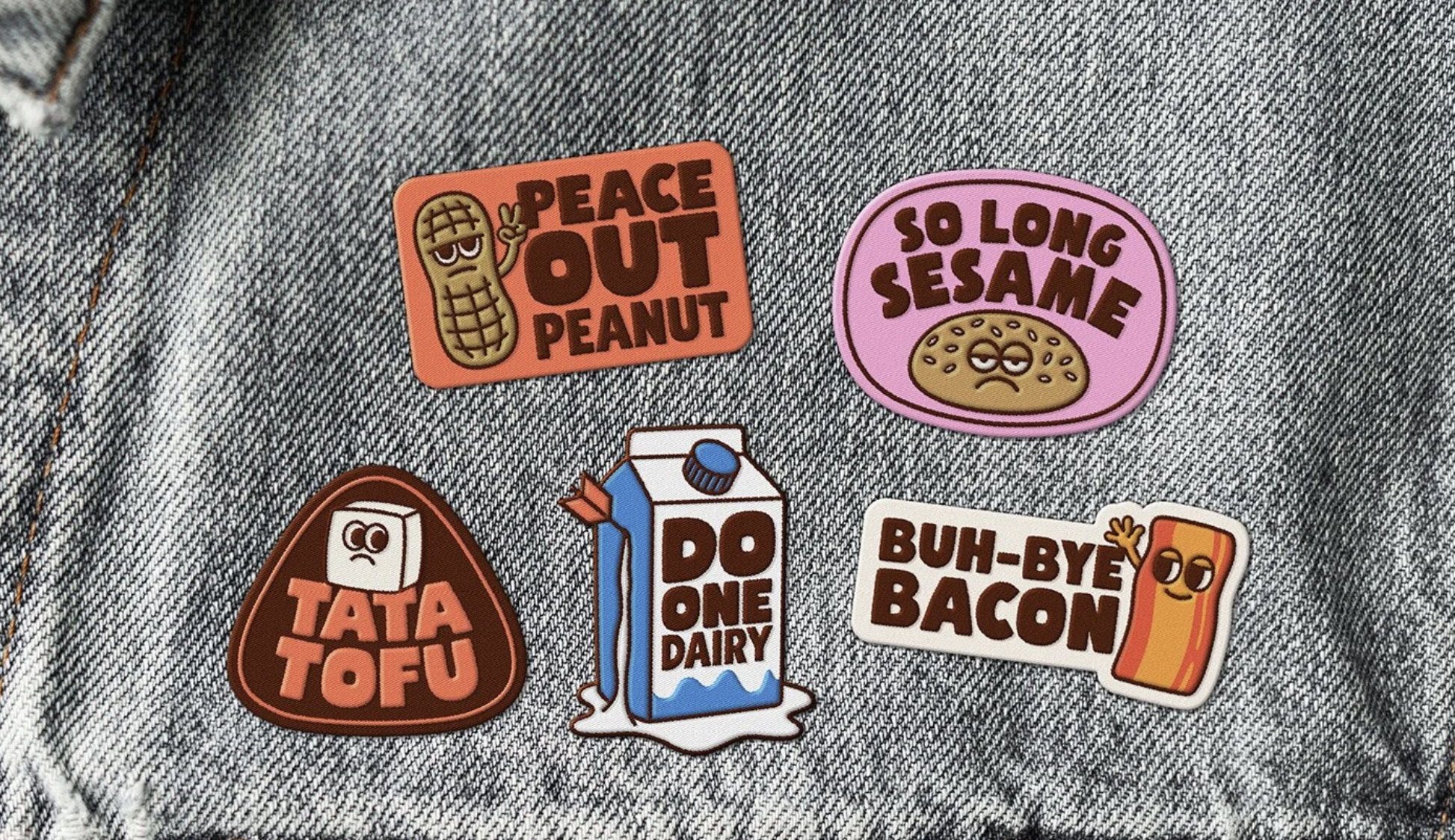
The ‘Food Bandits’ became badge assts for the brand.
Self-promotion without the ick
The final part of our conversation was about self-promotion, and why it can feel so uncomfortable.
I admitted that running a studio means being responsible for your own marketing. Increasingly, that seems to mean getting your face out there, speaking with authority, and “LinkedInifying” yourself until you start to sound like a corporate robot.
Kirsten’s advice was simple: don’t lose your voice.
For her, much of the work is for nonprofits or social-purpose brands such as Edible. So she reframes self-promotion as cause promotion. It is less about saying “look at what I made” and more about saying “this is who this work is for, and this is what they are trying to change”.
That makes a lot of sense to me.
Alex has also found a more comfortable route into promotion. He doesn’t want to become a foodie influencer. Instead, he talks about his experience as a designer, founder and accessibility advocate.
A short explanation of why a menu full of numbers is difficult to use can open someone’s eyes to an experience they have never considered. That is much more powerful than copying whatever format happens to be popular online.
We also talked about how self-promotion has become almost synonymous with social media. But going to events, talking to people, and sending something by post all count.
Alex’s lamppost stickers are a great example. A few hundred stickers generated hundreds of responses. You would be lucky to achieve that kind of engagement through digital advertising for the same money.
Print is not dead. A beautifully made portfolio magazine sent to a potential client may stay on their desk far longer than an email disappears into an inbox.
Sometimes the most effective self-promotion is something physical, personal and thoughtfully made.
Making room for better conversations
We finished by talking about the relationship between designers and clients.
There is a lot of blame placed on clients in the design industry when a project becomes difficult. But a client is not the enemy. They are the person who trusts you with their money, their organisation, and often a deeply personal idea.
As Kirsten said, they are allowing us to do what we love.
Good brand identity design depends on communication. It depends on educating clients, explaining concepts, and creating enough trust for a good idea to survive the uncertainty of the process.
That is what made this episode special. We weren’t only talking about the finished Edible identity. We were hearing from both sides: the founder’s experience and the designer’s process.
And that is still too rare.
_
Thanks again to Kirsten and Alex for joining me. And thanks for making room at the table.
If you’re building a purpose-led business and need help turning a meaningful idea into a clear brand, contact Wiselove Studio. I’d love to hear what you’re working on, whether that means brand identity design, illustration, campaign design, print or a thoughtful logo design rooted in a bigger story.
File under