
LogoArchive feature (and the lesson of rejection)
I did some pro bono work for my local Celtic FC Supporters Club. It was rejected, but like a phoenix from the flames, it's now featured in the LogoArchive.

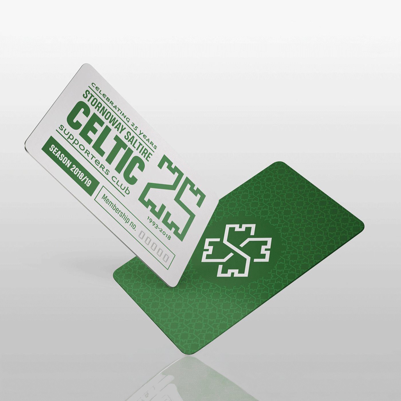
As the Stornoway Saltire Celtic Supporters Club entered its 25th year, it considered revamping its logo. I had recently joined and offered my services pro bono.
From my early sketches, I quite liked taking the shape of the distinctive Stronoway Castle Turrets and making numbers and lettering from it.

It was one of those lightning bolt moments when looking at the Stornoway Saltire initials, I realised that by turning them at 45 degree angles and overlapping them, they made a stylised 4-leaf clover - the main symbol of Celtic Football Club.

I created mockups to illustrate the logo's application and redesigned the membership card. I submitted this to the committee, which was having a board meeting soon. I thought it was a formality that they would love the work, and the logo would last for the next few years for the club.


The board came back and said it was ‘too contemporary’, and they wanted to stick with their original logo. Oh.
I was disappointed, of course, but there is a big lesson to take from this:
Because it was pro bono, I shortcut it and didn’t go through the full W.I.S.E. design process. I didn’t give a full and proper consultation about the club’s vision, and get a full overview of their needs from the design. I was treating it like a chance to show off my skills and get a nice portfolio piece.
It reminds me that designing without a proper strategy can lead to a big fat miss of the target.
They liked the stylised ‘25’ and kept it for their anniversary campaign. Glad to be of some help!
__
If you want to sign up for the full and proper W.I.S.E. design process to get your next logo/football crest on point, you can BOOK ME NOW.
Written by
Pearse O’Halloran
Senior Graphic Designer and Founder of WiseLove Studio
_
File under