+ LOGO DESIGN + BRANDING
The Brief
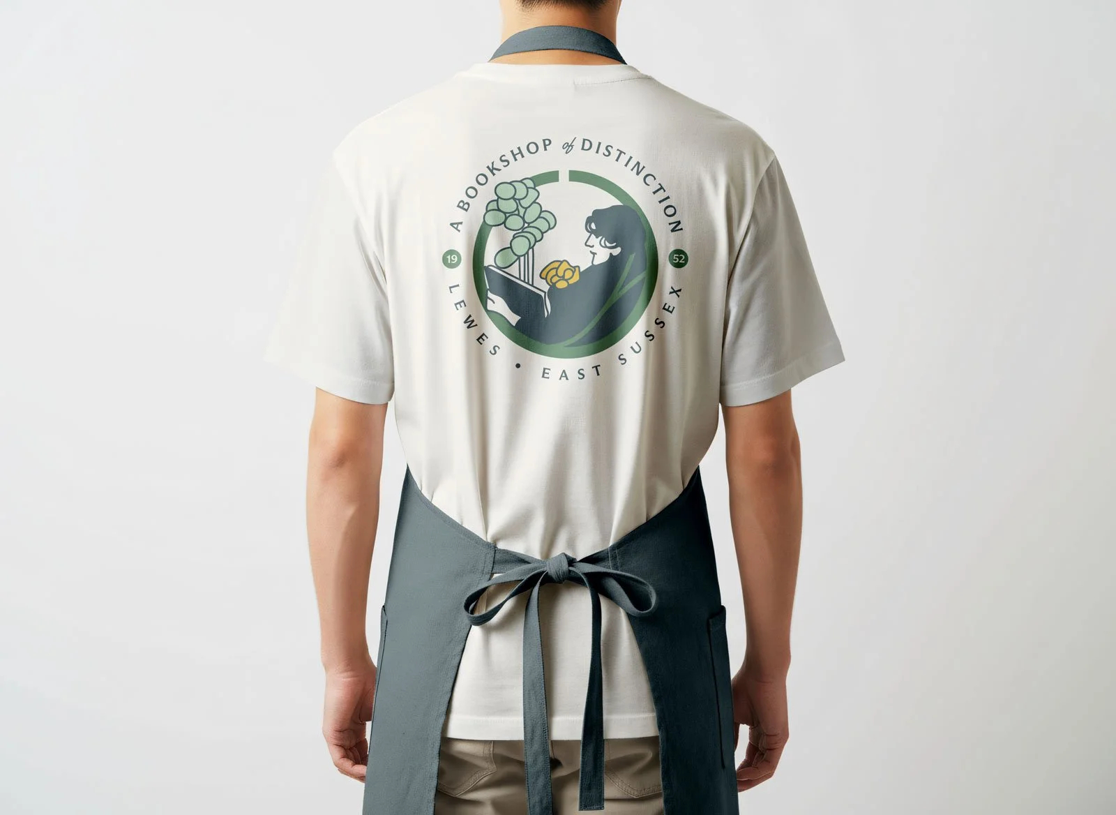
Holt & Pike is an independent bookshop occupying a converted Victorian ironmonger’s on the corner of Lewes High Street. Two floors, creaking boards, and a stock list chosen entirely by its five staff, not by algorithm or publisher co-op money. Every table is curated by hand, and every shelf carries handwritten cards from whoever read the book last.
The Solution
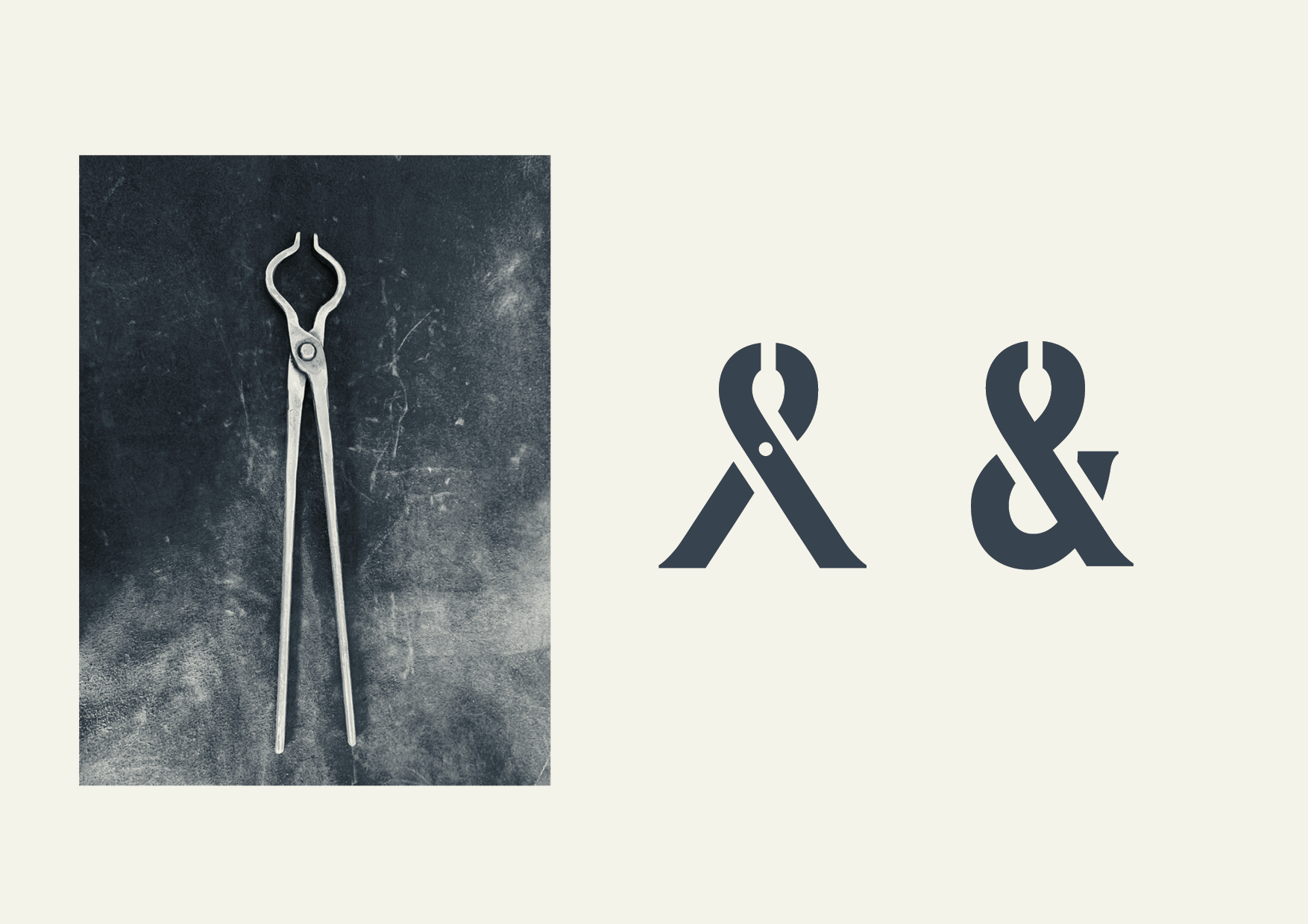
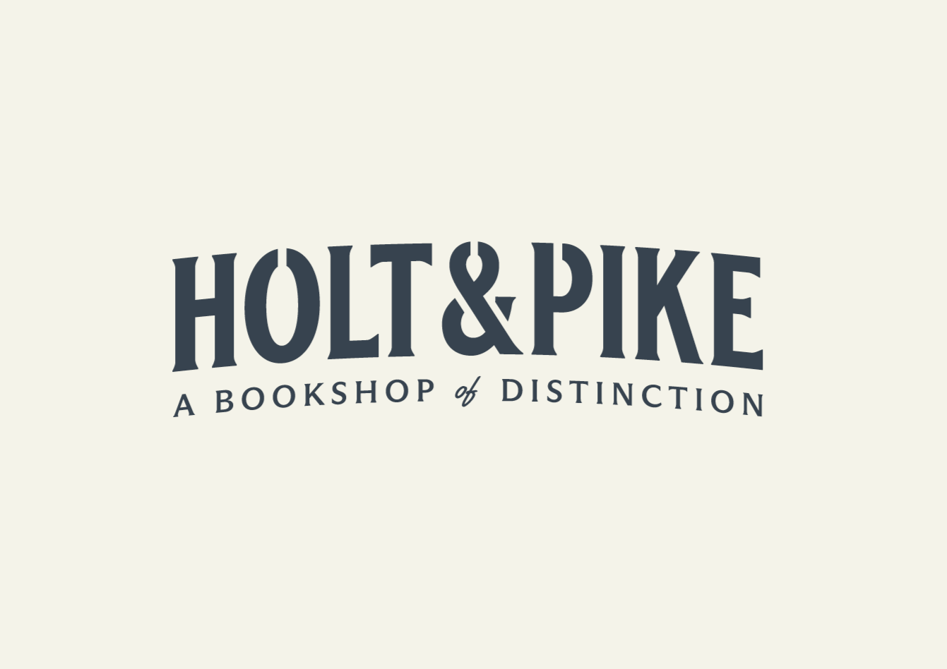
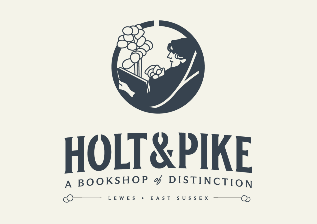
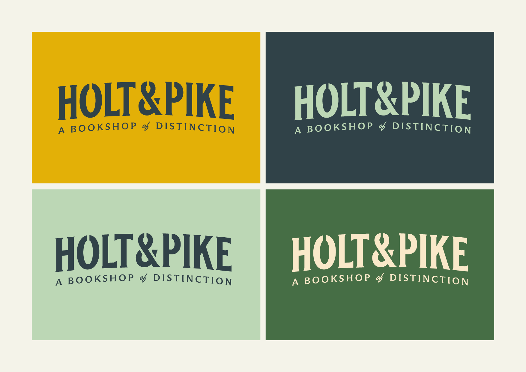
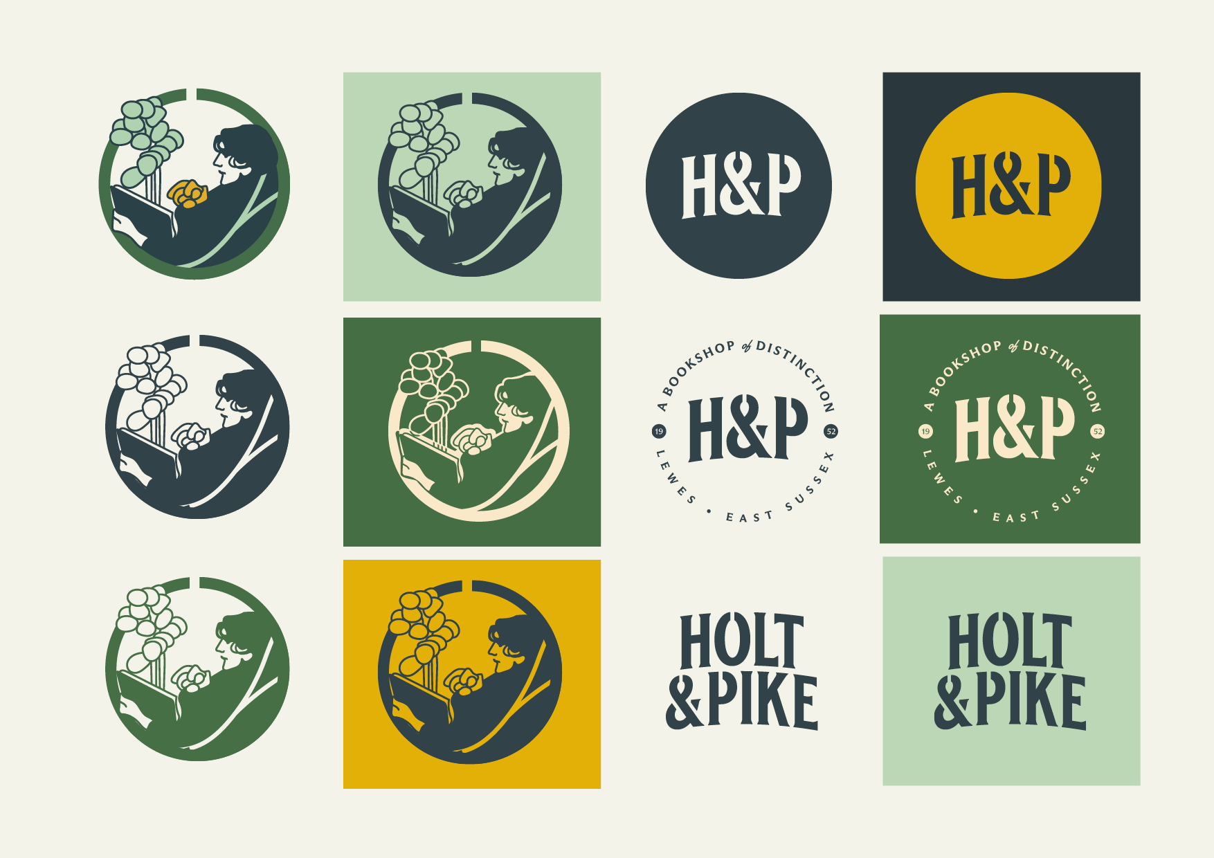
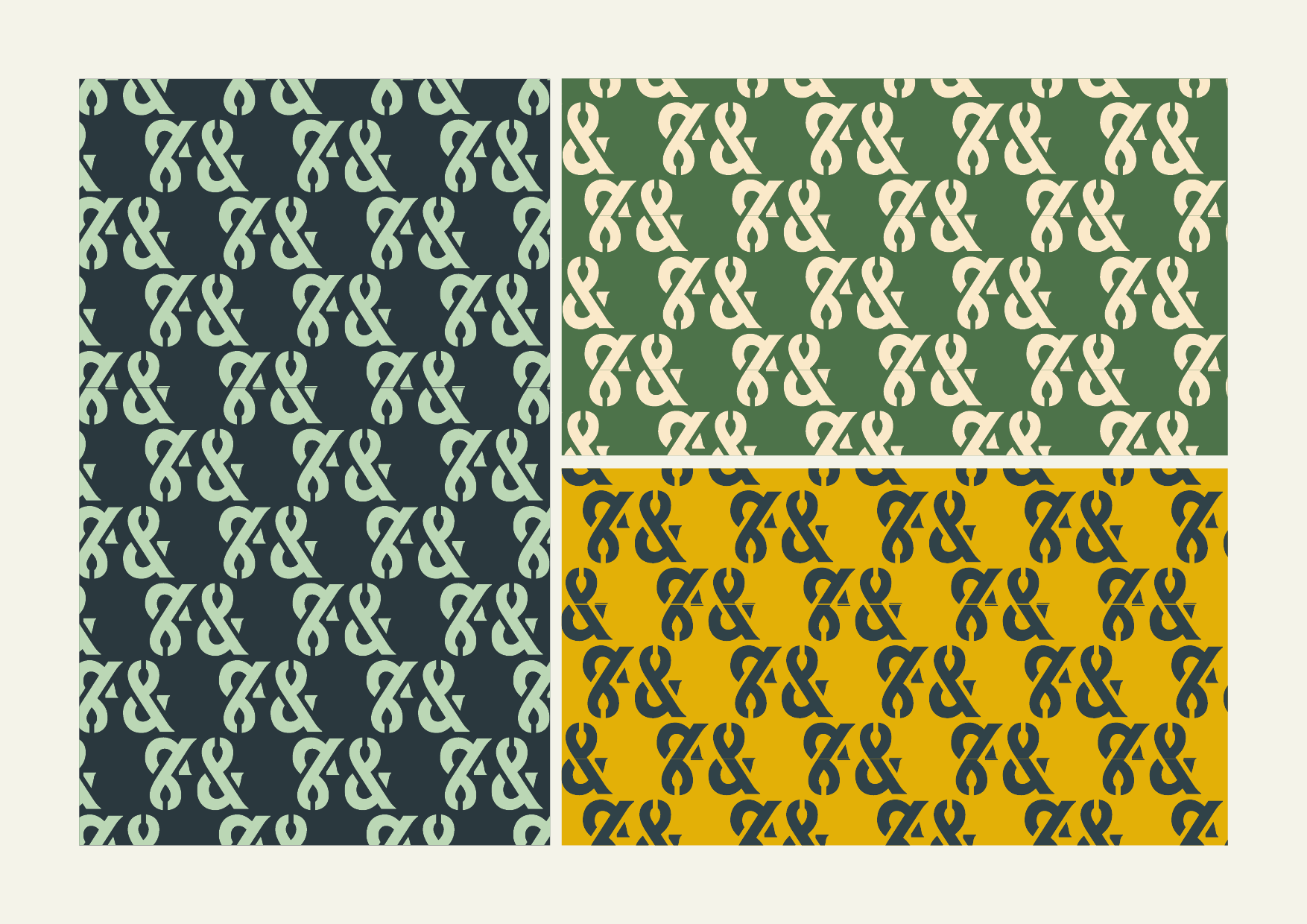
Play on the history of the shop premises and use the shape of an Ironmonger's tongs to form an ampersand. This sits at the centre of the stylised wordmark, shaped in a softly Victorian style.
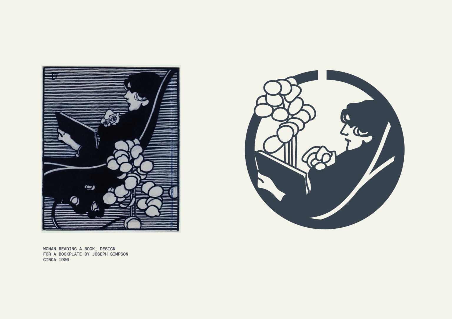
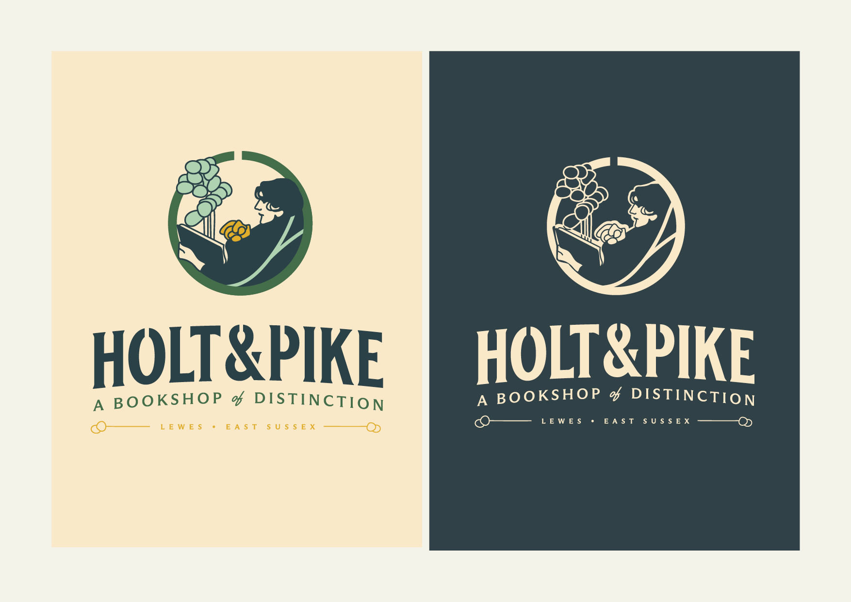
I've also introduced a more illustrative element based on an Art Deco drawing from 1902. This raises the calibre and softens the weight of the Ironmonger feel.
Logo Design
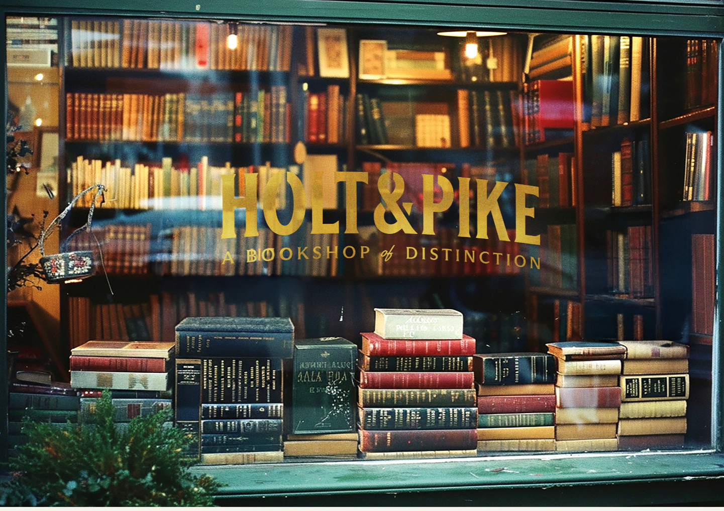
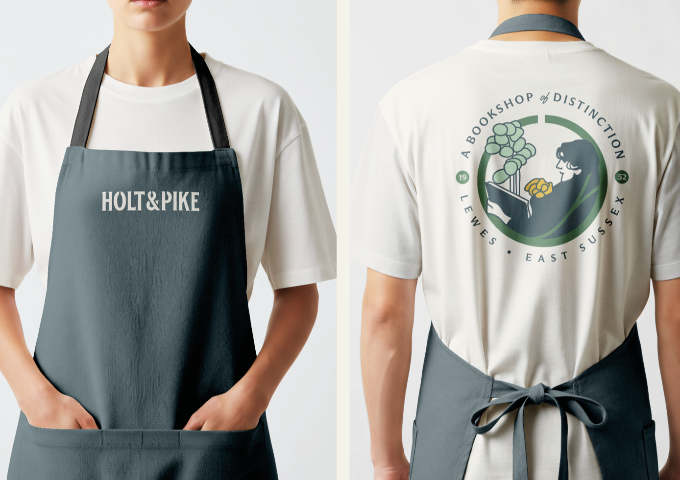
Application
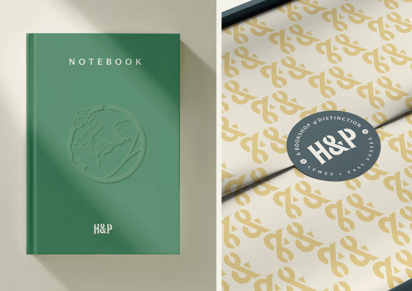
This project was created as a response to the Logo Design Challenge in James Barnard’s Designerrrs Community.
Holt & Pike was a lovely reminder that the best starting point for a logo isn’t a trend or a shortcut. It’s a close look at the story, the setting and the details that make a business its own. That’s the thinking I bring to my logo design and branding services.
If you’re ready to explore a brand identity with a story behind it, let’s start a conversation. I’d love to hear what you’re building.
File under